- GalaxianExplosion
- Freezing Water in Mouth
 Offline
- Registered: March 27, 2020
- Posts: 26,873
Re: Time finally decides to make one of these - An art thread
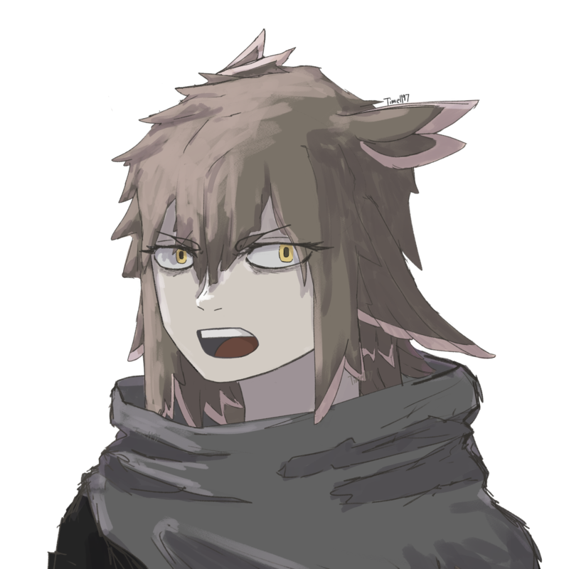
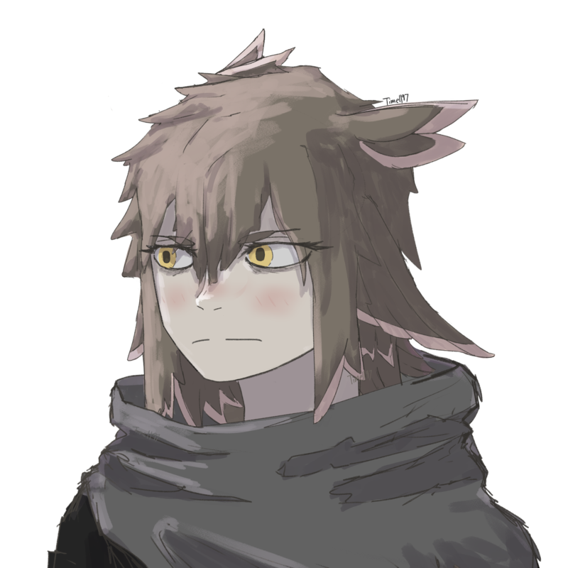
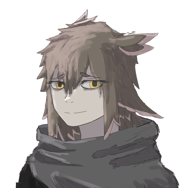
That's a girl??
-Galaxian-
Whoever you are, no matter how lonely,
the world offers itself to your imagination,
calls to you like the wild geese, harsh and exciting—
over and over announcing your place
in the family of things.
- Time
- Moderator
 Offline
- Registered: March 28, 2020
- Posts: 8,594
Re: Time finally decides to make one of these - An art thread
I can see how she can ambiguous in appearance, but I feel that can also be said about nearly all of my characters. The anime-fication of everyone kinda takes away at defining characteristics
Have have been thinking about exaggerating eyelashes and stuff
Time
Bruh the signature be wacky
- •
- Time
- Moderator
 Offline
- Registered: March 28, 2020
- Posts: 8,594
Re: Time finally decides to make one of these - An art thread
Or eyes in general
Time
Bruh the signature be wacky
- •
- LazyOwlViolet
- Forumer
 Offline
- From: Genesis
- Registered: August 29, 2023
- Posts: 697
Re: Time finally decides to make one of these - An art thread
fun fact
irl it's men that typically have long eyelashes not women
they/them
you can call me Vio
too lazy to put something here
sun and moon brainrot
- Time
- Moderator
 Offline
- Registered: March 28, 2020
- Posts: 8,594
Re: Time finally decides to make one of these - An art thread
Yeah, I think I have pretty long eyelashes myself
But something something gender norms and expectations and how people think of things and so forth
Time
Bruh the signature be wacky
- •
- Time
- Moderator
 Offline
- Registered: March 28, 2020
- Posts: 8,594
Re: Time finally decides to make one of these - An art thread
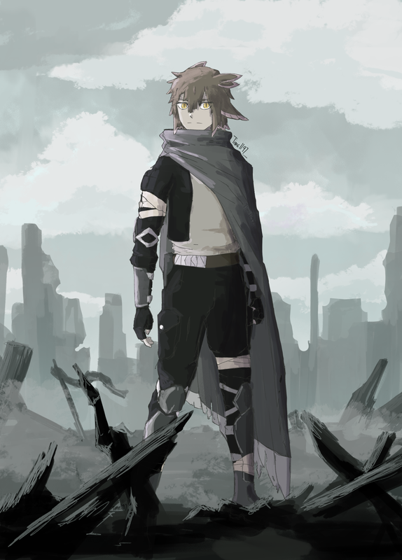
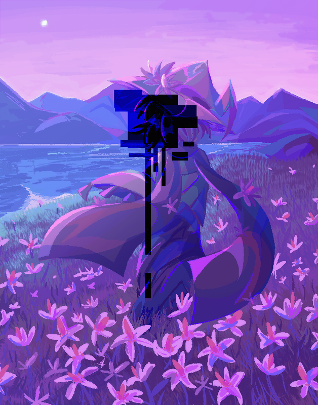
New character
Say hi
Last edited by Time (August 3, 2024 19:59:03)
Time
Bruh the signature be wacky
- •
- GalaxianExplosion
- Freezing Water in Mouth
 Offline
- Registered: March 27, 2020
- Posts: 26,873
Re: Time finally decides to make one of these - An art thread
HI! Are you a guy this time? :D
(Aesthetic on point btw, Time. Love the vibes)
-Galaxian-
Whoever you are, no matter how lonely,
the world offers itself to your imagination,
calls to you like the wild geese, harsh and exciting—
over and over announcing your place
in the family of things.
- Time
- Moderator
 Offline
- Registered: March 28, 2020
- Posts: 8,594
Re: Time finally decides to make one of these - An art thread
NOPE! Thanks for the compliment tho
When will the daycome when Time will break the cycle of drawing females????
I will let you know she was originally planned to be a guy but I made her a girl because the party would have been imbalanced.
Oh this is another TTRPG character btw. I've retired Articus, and am soon going to retire Silvis. Sooo bringing in someone new for a new campaign!
Last edited by Time (August 4, 2024 14:45:18)
Time
Bruh the signature be wacky
- •
- Time
- Moderator
 Offline
- Registered: March 28, 2020
- Posts: 8,594
Re: Time finally decides to make one of these - An art thread
The fun thing is that in this campagin we're using FoundryVTT, so I can readily change her token and expressions, so I have a whole set of sprites for different reactions like in a visual novel lol
Time
Bruh the signature be wacky
- •
- Echowo
- Prince Peepaw of Darkness
 Offline
- From: BEHIND YOU
- Registered: April 12, 2020
- Posts: 13,395
Re: Time finally decides to make one of these - An art thread
She looks so cool owo
💜Echo💜
he/him xe/xem
- Time
- Moderator
 Offline
- Registered: March 28, 2020
- Posts: 8,594
Re: Time finally decides to make one of these - An art thread
Thank you, with this character I had a wider range of things to pick and choose from, since the world here is much more diverse and modern. I mean that doesn't really change the character design much now thinking about it, but it does change what background I could put her in ha
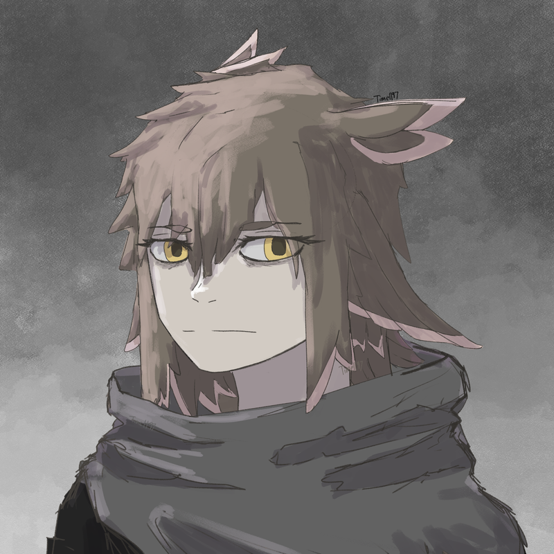
Idk if you could tell, but she's also a bird-person. I tried hinting at it in the design
Last edited by Time (August 4, 2024 14:52:32)
Time
Bruh the signature be wacky
- •
- Echowo
- Prince Peepaw of Darkness
 Offline
- From: BEHIND YOU
- Registered: April 12, 2020
- Posts: 13,395
Re: Time finally decides to make one of these - An art thread
I can see it in the hair :0 which my first thought when seeing the hair was both weirdly "bird" and "axolotl" XD
💜Echo💜
he/him xe/xem
- SpecterTheGreat
- Moderator
 Offline
- Registered: March 27, 2020
- Posts: 23,417
Re: Time finally decides to make one of these - An art thread
What!!!! Time that's so cool! Look at that background foreground like ofc yes I love the character design but I think the background just really takes the cake omg???
Well I mean it's not JUST the background but also the fact that the coloring on the character goes just perfect with the lighting around! Hair looking amazing btw
Also on your previous picture, I was 100% sure that was a guy too, actually surprised that it turned out to be a girl lol
Specter
When the imposter is sus
ඞඞඞ
- Time
- Moderator
 Offline
- Registered: March 28, 2020
- Posts: 8,594
Re: Time finally decides to make one of these - An art thread
I can def see axolotl. Actually when I showed off the design one of the DMs guessed axolotl too. I also tried making her cloak vaguely look like a bird wing (see the slanted end)
Also thanks Spec! I used a good amount of reference on this one. I think I did pretty good for my skill level. I wanted to make the entire canvas cinemascope ratio but that is a lot of background drawing so I went against it lol.
But also... Interesting.... you found my last character to be a guy as well... I mean, that isn't too much coming from you since I do know your preference of men that look rather... feminine, but two is the possible start of a pattern. What made you think that, if you don't mind me asking?
Time
Bruh the signature be wacky
- •
- Echowo
- Prince Peepaw of Darkness
 Offline
- From: BEHIND YOU
- Registered: April 12, 2020
- Posts: 13,395
Re: Time finally decides to make one of these - An art thread
Ooh, I didn't notice that detail before, but now looking at the cloak owo I can see it she has a very cool design 10/10
What kind of brush do you use for the background? I love the texture
💜Echo💜
he/him xe/xem
- Time
- Moderator
 Offline
- Registered: March 28, 2020
- Posts: 8,594
Re: Time finally decides to make one of these - An art thread
Most of the texture stuff like the clouds were made with the CSP Pro's dry ink brush, but a slightly edited to not have some weird coloring effect that goes on with the standard brush
Time
Bruh the signature be wacky
- •
- SpecterTheGreat
- Moderator
 Offline
- Registered: March 27, 2020
- Posts: 23,417
Re: Time finally decides to make one of these - An art thread
Time wrote:
But also... Interesting.... you found my last character to be a guy as well... I mean, that isn't too much coming from you since I do know your preference of men that look rather... feminine, but two is the possible start of a pattern. What made you think that, if you don't mind me asking?
I haven't thought a lot about it but I think it might be the way you do facial structures in a more solid way. Generally in anime-y styles, women tend to have sharper chins while men have more of a defined jawbone structure, if that makes sense? Idk what ele really would be there, I don't use eyelashes as a way to differentiate between gender (just as part of design) because I give everyone eyelashes regardless of that so maybe that's just it.
Also the hairstyle in that piece just feels more masculine to me for some reason I know it's not a super relevant thing but yeah
Specter
When the imposter is sus
ඞඞඞ
- Time
- Moderator
 Offline
- Registered: March 28, 2020
- Posts: 8,594
Re: Time finally decides to make one of these - An art thread
This is some pretty insightful feedback Spec, thanks for telling
I will admit when I look at most of my current characters now, some do be looking pretty androgynous
It's the PMoon artstyle affecting me, that's what I say.
It's a ramble but in Project Moon games there are characters are very obviously male or female, but for others it's practically impossible to tell (especially in Library of Runia). Plus PM doesn't really care about female characters having male names and male characters having female names, so that desn't add much to help with that lol
Time
Bruh the signature be wacky
- •
- SpecterTheGreat
- Moderator
 Offline
- Registered: March 27, 2020
- Posts: 23,417
Re: Time finally decides to make one of these - An art thread
I kneel to PMoon for their androgynous designs and names but I definitely can notice certain elements shared between them and your art, even from beforehand. I think it's mostly the lines and structure. This is just my impression but I feel like you go more towards geometrical shapes and straight lines for construction instead of more organic shapes and curved lines.
Like I have trouble when my construction lines are too straight so I opt for giving them more of a "swirl", a difference especially visible in how the hairstyles you draw have a lot of spikes instead of being more flowy, even in longer haired characters. I think it also affects even the hands, as I've heard that male characters should be depicted with more square-looking fingers and hands while females have more slender hands (and I think this is why almost everyone I draw looks femenine, I can't do that difference well enough yet).
But anyways on this last piece I think you did really well, I can see the fingers being more rounded instead of boxes and I can also see a variety of line structures in the clothing.
Specter
When the imposter is sus
ඞඞඞ
- Time
- Moderator
 Offline
- Registered: March 28, 2020
- Posts: 8,594
Re: Time finally decides to make one of these - An art thread
No I definitely get what you're putting down. Like I have also noticed that even when I try and make more curly and swirly hair as you mentioned, they end up still being pretty spikey.
Same with the hands, I actually really prefer boxy and square hands no matter what because they're easier to draw lol. I'm going to attribute me thinking it's cool and ok to do so due to JJK's hands. While I may not like the story, I do like the artstyle a lot (it's also interesting to see how it has changed over the years)
But now that you mentioned the little changes, I can see them too. That's nice. Thanks 👍
Time
Bruh the signature be wacky
- •
- Time
- Moderator
 Offline
- Registered: March 28, 2020
- Posts: 8,594
Re: Time finally decides to make one of these - An art thread
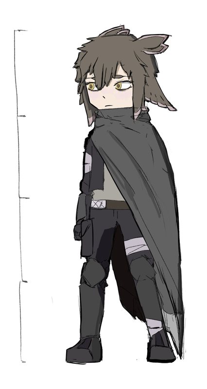
I was finally getting around to practicing chibi characters, featuring a certain birdbrain
I'm sure that you can see it, but I really didn't think about putting too much effort or perfecting things. Just a quick practice (by my standards)
I can see loads of issues that I'd like to change, but you know just putting some art out here to do so
I realize I've actually never talked much on the birdbrain. She's a bit mean. I didn't plan on making her very mean, but she bullies other people. So she's mean. I meant her to be a responsible person, but I think she's somewhere inbetween a responsible person and a troublemaker. She will make trouble, but she has a brain so she won't do anything extremely stupid.
I think she may have a bit of a napoleon complex, that too. But that's not because she's short. That's because she's not the most mentally stable (tbh if you're not making a TTRPG character mentally unstable, what are you doing???). Ik it doesn't really on the unemotive expressions I've shown here. But it does show on the sprite list.
Last edited by Time (August 25, 2024 01:33:47)
Time
Bruh the signature be wacky
- •
- Time
- Moderator
 Offline
- Registered: March 28, 2020
- Posts: 8,594
Re: Time finally decides to make one of these - An art thread
Time wrote:
I was finally getting around to practicing chibi characters, featuring a certain birdbrain
Not my homethread but update! She's done something really really stupid and is going insane! 😍😍😍
Time
Bruh the signature be wacky
- •
- Echowo
- Prince Peepaw of Darkness
 Offline
- From: BEHIND YOU
- Registered: April 12, 2020
- Posts: 13,395
Re: Time finally decides to make one of these - An art thread
Time wrote:
Time wrote:
I was finally getting around to practicing chibi characters, featuring a certain birdbrain
Not my homethread but update! She's done something really really stupid and is going insane! 😍😍😍
Slay! ✨️
💜Echo💜
he/him xe/xem
- Time
- Moderator
 Offline
- Registered: March 28, 2020
- Posts: 8,594
Re: Time finally decides to make one of these - An art thread
Gaslight, Gatekeep, Girlboss!
Only that she's just gaslight
And the person she's gaslighting is herself.
Time
Bruh the signature be wacky
- •
- Echowo
- Prince Peepaw of Darkness
 Offline
- From: BEHIND YOU
- Registered: April 12, 2020
- Posts: 13,395
Re: Time finally decides to make one of these - An art thread
As she should, honestly
💜Echo💜
he/him xe/xem
- SpecterTheGreat
- Moderator
 Offline
- Registered: March 27, 2020
- Posts: 23,417
Re: Time finally decides to make one of these - An art thread
Forumers after making the most traumatized and mentally unhealthy character: ✌🏻❤
Thinking back I don't think I recall you ever drawing a chibi before (or at least posting chibi art) so this is definitely differently. Chibi proportions are tough ngl and I admire that you drew out the proportion lines at the side xD honestly it looks really good overall and I think the only thing I would mention is in regards to the coloring that the blush thingy on her cheeks looks kind of off. I'd suggest maybe making it a bit more to the orange side so it blends with the skin tone better, cause rn it doesn't look like blush it just feels a bit weird and grayed out area.
I was about to remark on the inspiration for the chibi itself but I just saw the image name... so yeah I can't joke if it's true xD
(Any chance you might show the sprite list? 👀)
Specter
When the imposter is sus
ඞඞඞ
- Time
- Moderator
 Offline
- Registered: March 28, 2020
- Posts: 8,594
Re: Time finally decides to make one of these - An art thread
SpecterTheGreat wrote:
Forumers after making the most traumatized and mentally unhealthy character: ✌🏻❤
Real
SpecterTheGreat wrote:
Thinking back I don't think I recall you ever drawing a chibi before (or at least posting chibi art) so this is definitely differently. Chibi proportions are tough ngl and I admire that you drew out the proportion lines at the side xD honestly it looks really good overall and I think the only thing I would mention is in regards to the coloring that the blush thingy on her cheeks looks kind of off. I'd suggest maybe making it a bit more to the orange side so it blends with the skin tone better, cause rn it doesn't look like blush it just feels a bit weird and grayed out area.
I was about to remark on the inspiration for the chibi itself but I just saw the image name... so yeah I can't joke if it's true xD
The reason why the proportion lines are there is because this was my very first time drawing a chibi lol. I totally forgot I did a blush thingy, and tbh on my screen I can't even see it, but that may be the nature of my current setting (after dark with barely any light). I didn't actually want to think too much about the linework or accuracy of really anything in this little chibi drawing. I kinda just wanted to get the idea of it with this one. Nevertheless, that piece of advice sounds pretty helpful! I'll look to apply it later on. I'll try orange for sure since I think I went with a pretty desaturated red/pin. Thanks!
SpecterTheGreat wrote:
(Any chance you might show the sprite list? 👀)
Coincidentally I did organize and create enough sprites for me to be satisfied as of the moment, so sure why not, I'll get them here at some point.
Last edited by Time (August 28, 2024 01:38:03)
Time
Bruh the signature be wacky
- •
- Time
- Moderator
 Offline
- Registered: March 28, 2020
- Posts: 8,594
Re: Time finally decides to make one of these - An art thread
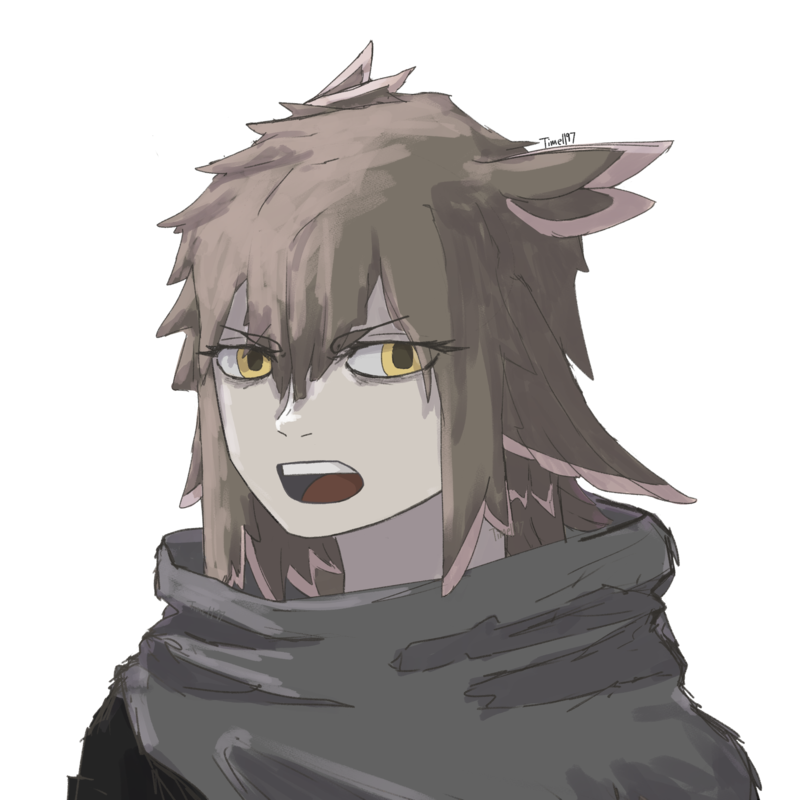
Sprite list for the birdbrain. There is a lot of them so I lowered the size by a lot
Angry sprites 1-5
confused sprite 1
mischievous sprite 1
eepy
I was considering adding "having a nightmare" variant, as you do with characters with trauma, but I HIGHLY doubt I'll even use this sprite in the first place so I didn't want to do more work.
embarrassed sprites 1-2
I-it's not like I like you or anything! Baka!
fear sprite 1
Bittersweet sprites1-3
happy sprites 1-2
sadness sprites 1-5
What I find really funny is the ratio from happy to sad sprites lol
serious sprite 1
treated as an alternate sprite for the default expression (the which was the second image of her back in the first post I made on her)
shocked sprites 1-2
As you can see some of the expressions were reused, but a lot of it was mixing and matching stuff.
Actually working on this stuff did help me with practicing emotions a bit. Don't get to do that too often with how deadpan most of my characters look.
Time
Bruh the signature be wacky
- •
- Time
- Moderator
 Offline
- Registered: March 28, 2020
- Posts: 8,594
Re: Time finally decides to make one of these - An art thread
Huh looks like postimage didn't want to downsize my images. That's fine.
I also realized I never said her name. for the goofs I'm going to keep it a secret for no reason.
No it is not the file names either.
Time
Bruh the signature be wacky
- •
- Time
- Moderator
 Offline
- Registered: March 28, 2020
- Posts: 8,594
Re: Time finally decides to make one of these - An art thread
There are some unused assets (idk what else to call them)
Such as a :3 mouth, and a pouting mouth
Time
Bruh the signature be wacky
- •

