- Time
- Moderator
 Offline
- Registered: March 28, 2020
- Posts: 8,584
Re: Time finally decides to make one of these - An art thread
Actually new art for once
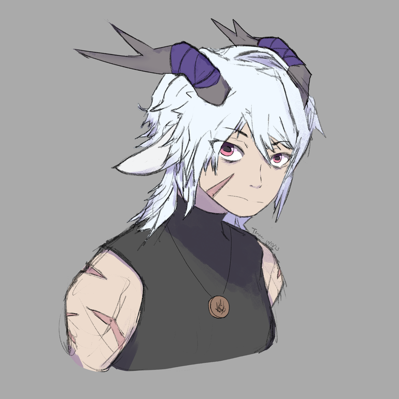
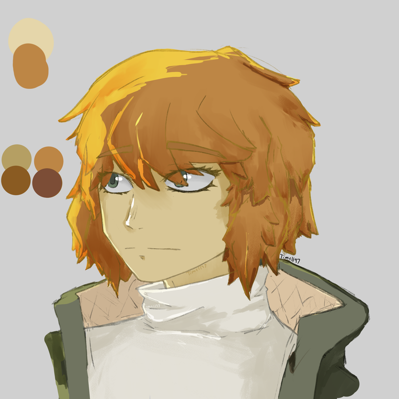
Shoulders up for da token
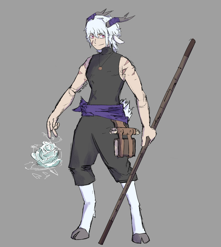
Fullbody
Say hi to a new dnd character to add to my collection: Articus Winterrose!
Just a druid who like's to stargaze. Totally nothing else going down underneath the surface. Yup.
Imma admit, the lineart here was super sloppy. But I kinda like it. I don't like super clean line art all the time. I was never in the camp of thinking "clean line art = skill"
Also, decided a simple design with this one. She's still a rooky adventurer, so not much glamor and epic design, yes?
Last edited by Time (October 20, 2023 19:33:29)
Time
Bruh the signature be wacky
- Echowo
- Prince Peepaw of Darkness
 Offline
- From: BEHIND YOU
- Registered: April 12, 2020
- Posts: 13,392
Re: Time finally decides to make one of these - An art thread
Hello Articus owo
I like the lineart uwu
Is she albino or is it one of those "just so happens" type color pallettes owo?
✨️Echo✨️
he/him xe/xem
- Time
- Moderator
 Offline
- Registered: March 28, 2020
- Posts: 8,584
Re: Time finally decides to make one of these - An art thread
Thank you
No I actually hadn't thought of that... it's a cool notice tho. Maybe she is. It's a really cool angle and insight that I didn't think of, Echo
Articus is named after the star Arcturus (I pronounced it wrong and it became her name)
Winterrose comes from Hellebores plants, an evergreen flower plant. Articus’s eyes are supposed to be a similar color.
The white hair was to kinda match snow or something like that, since she lived in the mountains before the campaign. It was kind of hard to communicate she was a snow person or whatever when the design was meant for a campaign where the main location is sunny and temperate.
Last edited by Time (October 22, 2023 00:44:55)
Time
Bruh the signature be wacky
- •
- SpecterTheGreat
- Moderator
 Offline
- Registered: March 27, 2020
- Posts: 23,417
Re: Time finally decides to make one of these - An art thread
Okay so I had to check your previous art for this because I wasn't sure but I like the way you designed her eyes! I think the pupil is a nice touch to the goat(???) aesthetic and yeah she looks cool. I like her :] smile.
I'm also not sure how you rendered this or what brush you used for lineart because I think the finished image looks good. (Is it just me or does her staff look kinda mechanical?)
Overall I like the design because of how it fits with the description you wrote. Even though simple by "fantasy standards", it works well.
Specter
When the imposter is sus
ඞඞඞ
- Time
- Moderator
 Offline
- Registered: March 28, 2020
- Posts: 8,584
Re: Time finally decides to make one of these - An art thread
Yea, she's a saytr. Or a goat. I'm really happy that you noticed that detail.
As to the brush I used for lineart, it was some free brush I found on CSP Assets. If you use CSP, I can give it to you if you want it. As for the shading I just went with a standard multiply layer + a more monotone purple/blue. I used a default CSP brush for it, and just varied my weight (which I've been trying to practice).
Time
Bruh the signature be wacky
- •
- Time
- Moderator
 Offline
- Registered: March 28, 2020
- Posts: 8,584
Re: Time finally decides to make one of these - An art thread
Time art drop
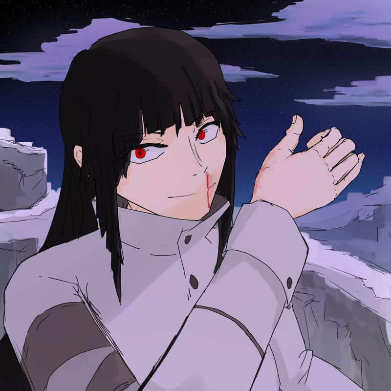
Oh I realize I never posted about my other D&D character here! Huh... well, this is her second art portrait, because I needed to update it and we were in a winter area and she had a winter coat on.
Say hello to the Sorcerer known as Silvis Yellowsail! One arrogant noble who has a taken an immense liking to magic.
...Oh, why is her nose bleeding? Well that could just be a byproduct of uh... experimenting with magic and people who aren't naturally apt for magic use. But oh no yeah she's totally a normal human yeah nothing twisted and wicked going behind those eyes there.
Hidden Sails Spoilers: I suppose this would be a comment for Echo only tbh
Lowkey when I read Cosmia's form I immediately thought of Silvis here. She has sorta the same thing going on lol, just more being unlikable than likeable
Last edited by Time (January 27, 2024 22:41:11)
Time
Bruh the signature be wacky
- •
- Echowo
- Prince Peepaw of Darkness
 Offline
- From: BEHIND YOU
- Registered: April 12, 2020
- Posts: 13,392
Re: Time finally decides to make one of these - An art thread
YIPPEE
✨️Echo✨️
he/him xe/xem
- Time
- Moderator
 Offline
- Registered: March 28, 2020
- Posts: 8,584
Re: Time finally decides to make one of these - An art thread
Hidden Sails Spoilers/ continuing that last comment toward Echo
Oh, and she got caught. And she did the experimentation for literally the fact she was just curious not some higher reasoning or greatness attached to it
Time
Bruh the signature be wacky
- •
- SpecterTheGreat
- Moderator
 Offline
- Registered: March 27, 2020
- Posts: 23,417
Re: Time finally decides to make one of these - An art thread
Always love some Time art :3 at first I thought there was some Hidden Sails art in the second half, but well lol it's always cool to see art in general and I'll take all the crumbs I can get.
The black hair + red eyes combo is one of my favorites, so it's always cool to see it on characters. I will always admire drawn starry skies. And also, I like the detail of the blood smear on her hand.
Specter
When the imposter is sus
ඞඞඞ
- Echowo
- Prince Peepaw of Darkness
 Offline
- From: BEHIND YOU
- Registered: April 12, 2020
- Posts: 13,392
Re: Time finally decides to make one of these - An art thread
Time wrote:
Hidden Sails Spoilers/ continuing that last comment toward Echo
Oh, and she got caught. And she did the experimentation for literally the fact she was just curious not some higher reasoning or greatness attached to it
honestly slay, me too fr
✨️Echo✨️
he/him xe/xem
- Time
- Moderator
 Offline
- Registered: March 28, 2020
- Posts: 8,584
Re: Time finally decides to make one of these - An art thread
SpecterTheGreat wrote:
at first I thought there was some Hidden Sails art in the second half, but well lol it's always cool to see art in general and I'll take all the crumbs I can get.
Sorry I baited you 😔, my art generation for Hidden Sails is pretty slow anyways and I'm saving them for the actual thing.
SpecterTheGreat wrote:
The black hair + red eyes combo is one of my favorites, so it's always cool to see it on characters. I will always admire drawn starry skies. And also, I like the detail of the blood smear on her hand.
I'm happy you noticed it! Tbf, I feel like I am not deserving of that starry sky compliment, as I just smacked that together without really thinking. But thank you for it nevertheless.
Time
Bruh the signature be wacky
- •
- Time
- Moderator
 Offline
- Registered: March 28, 2020
- Posts: 8,584
Re: Time finally decides to make one of these - An art thread
Echowo wrote:
honestly slay, me too fr
...what do you exactly mean by... "me too"?
Last edited by Time (January 30, 2024 04:12:28)
Time
Bruh the signature be wacky
- •
- Echowo
- Prince Peepaw of Darkness
 Offline
- From: BEHIND YOU
- Registered: April 12, 2020
- Posts: 13,392
Re: Time finally decides to make one of these - An art thread
:3c
✨️Echo✨️
he/him xe/xem
- Time
- Moderator
 Offline
- Registered: March 28, 2020
- Posts: 8,584
Re: Time finally decides to make one of these - An art thread
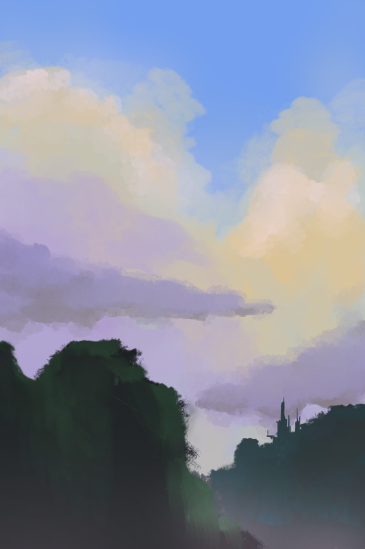
Testing my brushes and some backgrounds.
I wanted to add more, especially around the idea of something else more into the sky or like an artificial structure, but I decided not to or didn't really know what to put.
Last edited by Time (February 7, 2024 20:49:53)
Time
Bruh the signature be wacky
- •
- Echowo
- Prince Peepaw of Darkness
 Offline
- From: BEHIND YOU
- Registered: April 12, 2020
- Posts: 13,392
Re: Time finally decides to make one of these - An art thread
oooh I like the sorta painting style
(Cronches art)
✨️Echo✨️
he/him xe/xem
- Time
- Moderator
 Offline
- Registered: March 28, 2020
- Posts: 8,584
Re: Time finally decides to make one of these - An art thread
Thank youu
I like the clouds, but I do think the mountains need some work. It's pretty simple stuff so far.
I predict it tasks like candyfloss or the like.
Time
Bruh the signature be wacky
- •
- Time
- Moderator
 Offline
- Registered: March 28, 2020
- Posts: 8,584
Re: Time finally decides to make one of these - An art thread
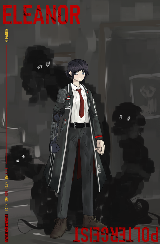
Please. Call me Eleanor. Uhm… so… are you the manager?
Sinner No. XX
Oh, you are? Well, what do you like? Color? Food? Hobbies? Oh! Maybe perhaps your interest in people? Ah, that sounds weird, sorry, but still…
...Whatever it may be, I’ll serve you to the best of my abilities! All the way to hell and back!
“Journeys end in lovers meeting; I have spent an all but sleepless night, I have told lies and made a fool of myself, and the very air tastes like wine. I have been frightened half out of my foolish wits, but I have somehow earned this joy; I have been waiting for it for so long.”
—
Peculiars
Unrelentingly Clingy, Irrationally Paranoid
Info
This Sinner has a record of overall competence, especially so in the fields of gathering of information and even some medical knowledge. However, much of her skills are frustratingly hard to access. She carries with her a highly unstable and paranoid state that requires constant attention lest if you wish for her to risk the chance of plans going awry. We recommend that you pay attention to her actions, and act accordingly to mitigate issues that may spill over, be it verbal or physical.
[CAUTION] This Sinner has a suspected history correlated with unexplained events occurring in her vicinity. It is recommended that you keep your distance.
—
It all changed since then. Ever since I had that taste of warmth, it’s all that I live for. Even if those things follow and dig away at me wherever I go…
… I’ll be willing to be anything, just for a sliver more.
—
Last edited by Time (April 19, 2024 16:15:05)
Time
Bruh the signature be wacky
- •
- Time
- Moderator
 Offline
- Registered: March 28, 2020
- Posts: 8,584
Re: Time finally decides to make one of these - An art thread
Ok now actual commentary:
Work on Hidden Sails or make a Limbus OC?
Limbus OC (I blame Specter for this one lol)
Meet Eleanor! Most of her character is actually still a WIP (Backstory and all that) but it's been really fun creating her so far. I've been thinking of maybe cooking up another character as well.
Anyways, I actually never really do this sorta stuff, because I usually don't like directly interacting with another story's world in such a direct way, like creating a character that would be seen to be apart of the main cast. Nevertheless it was fun to see creating a character and seeing how they'd fit into the world.
I decided to take this time to double up and do a little art study of the main artist of Library of Runia and Limbus Company, nai_ga. It was really interesting seeing how it goes.
Notes:
- I like how he draws his hands (boxes for fingers) I think that's because I do the same lol.
- Face was pretty easy to draw. Typical anime face with a nib for a nose. Though female characters have very exaggerated eyelashes. Oh, and something to note. I never noticed this except on a few really pale female characters, but they also have a little blush too.
- Why does he make legs for his characters so long 😭. It may not look like it in the final product, but I had to really STRECH the legs out to get something comparable to his art style.
- He definitely at times feels more of a character artist over a background artist. Even though I've seen good backgrounds by him, it looks like in most project moon works he places more effort in the characters. Which makes sense because this is a game about characters not backgrounds. I drew up Eleanor's background in like 20 min, but if I spent some more time I could fully emulate one of nai_ga's backgrounds (not the super good ones mind you, just the normal ones)
- On that note, he has a very specific way of panting backgrounds too. Like with lots of boxes and weird textures.
- From what I was doing, it seems he also knows COLOR THEORY and LIGHTING (gasp). I really need to pratice those more... side note it seems for most of his lighting and shadows for the Limbus company promo art/main character sprtes. He decided to use GREEN. Which is cool because most people just default to purple or use a multiplyer later. I guess it shows to know your color theory because I feel if you know that stuff, you can create more intresting lighting/color palletes/rendering.
- How this dude colors is really interesting to me. It's also really hard to replicate. I think I failed in fully replicating his lighting and rending style by a lot. His tend to be really sharp. My rendition in comparison was much more timid and soft when it came to rendering and lighting. I'd like to learn to be more bold with my lighting, because I really like Limbus's rendering and coloring style a lot.
- It feels like for both coloring and lighting, he uses really specific brushes (that I'd love to hunt for)
Last edited by Time (April 19, 2024 10:26:33)
Time
Bruh the signature be wacky
- •
- Time
- Moderator
 Offline
- Registered: March 28, 2020
- Posts: 8,584
Re: Time finally decides to make one of these - An art thread
anyways, tldr for the commentary post: it was fun and insightful trying to study another artist's style, even if I couldn't fully get it down.
Time
Bruh the signature be wacky
- •
- Time
- Moderator
 Offline
- Registered: March 28, 2020
- Posts: 8,584
Re: Time finally decides to make one of these - An art thread
This is making me tweak out I'm all done with the art and stuff and then I get tutorials on my feed that deal with light and values bruh wouldn't that have been a little bit more helpful it it showed up a bit earlier?
Time
Bruh the signature be wacky
- •
- Echowo
- Prince Peepaw of Darkness
 Offline
- From: BEHIND YOU
- Registered: April 12, 2020
- Posts: 13,392
Re: Time finally decides to make one of these - An art thread
Time wrote:
Please. Call me Eleanor. Uhm… so… are you the manager?
Sinner No. XXOh, you are? Well, what do you like? Color? Food? Hobbies? Oh! Maybe perhaps your interest in people? Ah, that sounds weird, sorry, but still…
...Whatever it may be, I’ll serve you to the best of my abilities! All the way to hell and back!
“Journeys end in lovers meeting; I have spent an all but sleepless night, I have told lies and made a fool of myself, and the very air tastes like wine. I have been frightened half out of my foolish wits, but I have somehow earned this joy; I have been waiting for it for so long.”
—
Peculiars
Unrelentingly Clingy, Irrationally Paranoid
Info
This Sinner has a record of overall competence, especially so in the fields of gathering of information and even some medical knowledge. However, much of her skills are frustratingly hard to access. She carries with her a highly unstable and paranoid state that requires constant attention lest if you wish for her to risk the chance of plans going awry. We recommend that you pay attention to her actions, and act accordingly to mitigate issues that may spill over, be it verbal or physical.
[CAUTION] This Sinner has a suspected history correlated with unexplained events occurring in her vicinity. It is recommended that you keep your distance.
—
It all changed since then. Ever since I had that taste of warmth, it’s all that I live for. Even if those things follow and dig away at me wherever I go…
… I’ll be willing to be anything, just for a sliver more.
—
IM GOING FERAL QHSGGSHXKAKDJAKSJ
I absolutely love the textures and stuff, and additionally the composition looks really good too owo
✨️Echo✨️
he/him xe/xem
- Time
- Moderator
 Offline
- Registered: March 28, 2020
- Posts: 8,584
Re: Time finally decides to make one of these - An art thread
Thanks! Good to hear that my art is evoking a feral emotion and has good compasition.
Also side note I was lowkey tweaking cuz you couldn't zoom in on the image in further detail but I changed the link to now you can zoom in if you click on the image
Also I forgot the eye shadow thing that nag_ai has on his characters (I was wondering why her face look a little bit odd when comparing to the refrence arts)
Last edited by Time (April 19, 2024 23:28:50)
Time
Bruh the signature be wacky
- •
- SpecterTheGreat
- Moderator
 Offline
- Registered: March 27, 2020
- Posts: 23,417
Re: Time finally decides to make one of these - An art thread
Oooh, Tart Time art time!
I wasn't expecting you to beat me to Alice's image so I will now have to up my game (this is totally /j, I wasn't expecting to see Eleanor's fullbody image at all but I am not complaining 👀) but wow, looks super cool. Please do tell me where you found the text assets tho or if you made them yourself (I need them).
I'll be taking full blame for this lol but also I didn't know the intrusive inspiration would hinder Hidden Sails progress 😭😭😭 (again, joking. this is super cool).
The thing that catches my attention the most is the background because I think it's a really good imitation of the "detailed but broad-stroked" style the artist has. I mean, you already did a whole study on that up there, but I'll say that's what caught my eye first when looking at the piece. Epic ghosts or something and they look like they're glitching but you can also make out that it's a house setting. Perfection, I love it.
As for Eleanor herself I really like the direction you chose to go in with the prosthetic arm. It doesn't stand out too much but you can clearly see it has combat purpose (I assume she can retract the blade) and it also works perfectly with the shoulder guard thing you implemented at the top. The general coloring in the clothes looks hard to emulate tbh, did you use blending or a brush with that specfic effect? And one more question is she supposed to have the dark lines under her eyes or not because I can't really make out if she does.
I haven't been able to stop thinking about the legs and tbh it was a lil hard for me to believe but I checked back on your art and yeah they are a lot longer than usual. I want to say maybe the long-legged style balances itself out with the longcoat design but then I remember the canon examples that don't wear a longcoat and I don't know what else to say. Ig all to mention is that they don't look out of place or exaggerated to me. Also I'm sure you noticed this as well but something that caught my eye about the og style is the blocky style of drawing footwear xD.
I think that'd be all for the art for now. I liked the little intro thing you posted along with it btw, especially the blurb after the info part. Jotting down the info in my Manager's notebook in case I ever encounter her 🕓📝.
Specter
When the imposter is sus
ඞඞඞ
- Time
- Moderator
 Offline
- Registered: March 28, 2020
- Posts: 8,584
Re: Time finally decides to make one of these - An art thread
Ha, guess you'll have to up your game indeed. I was originally planning just a standard fullbody in my style but I just decided to try something new out instead. It took me a while scrolling thru Clip Studio Paint for the proper text, but the font was called Bahnschrift SemiBold Condensed.
No worries honestly I just sometimes need to work on something else other than Hidden Sails every now and then
Yeah how the artist uses really broad strokes when texturing which is an interesting style. Though I've seen some art pieces where you can just see random brushes being used and it (to me at least) almost feels like patchwork 💀. Though don't get me wrong, when he really focuses in, they can be really nice. Plus I sometimes like the weird texturing. It makes things stand out.
I was just trying to somewhat replicate the backgrounds for the Sinner's promo art. I don't think it's the same quality as the backgrounds, but they are good enough. If I wanted to do a full recreation or smth, I'd probably have to add more layers of brushstrokes and stuff for sure. As to the ghosts, I just ended up using a specific brush for them I didn't think them as glitching, but now that you put it that way, I can see it, and I like the idea too.
As to coloring clothing, no I just used normal layers. No multiplying or anything like that. That's all. I wanted to get a read on the artist's coloring theory. But as I mentioned, I think I just need to be a little bit more bold with highlighting light and dark, and it'll end up looking similar enough.
Yeah you're right on the blade being retractable. She's also supposed to have a prosthetic leg but ofc you can't see that with pants. As for the dark lines under her eyes, yeah they're supposed to be there but it's just you can't really make it out as well from afar, you know?
Yeah PMoon's character sprites are known for having quite the long legs. I hear it's even a bit of a joke in the community. It's really apparent with a certain character in Library of Runia and for that there's a lot of jokes revolving around that topic with him. I guess people don't really notice it because we see the characters from the waist up most of the time. You did mention the longcoat really hides the legs, but I'm also guessing if everyone has long legs, it's not as apparent. Even if they are very long, I agree that it for some reason doesn't feel out of place. It only did so when I was drawing them.
Thanks! I wanted to replicate the character promos when they were first announced. Though it's sorta hard to do that in text form when the source material is in video form. (I also forgot to add the EGO name but that's fine that still wip or whatnot). But yes all managers do take note.
Time
Bruh the signature be wacky
- •
- Time
- Moderator
 Offline
- Registered: March 28, 2020
- Posts: 8,584
Re: Time finally decides to make one of these - An art thread
Just some warming up, revving up the art engines since school's sorta out.
honestly I should actually consistently practice art instead of just stopping for weeks or months.
Last edited by Time (July 13, 2024 00:43:38)
Time
Bruh the signature be wacky
- •
- Time
- Moderator
 Offline
- Registered: March 28, 2020
- Posts: 8,584
Re: Time finally decides to make one of these - An art thread
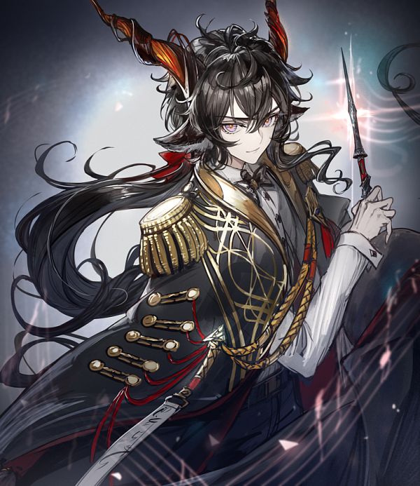
dawg when was the last time I drew a dude 😭
Time
Bruh the signature be wacky
- •
- Echowo
- Prince Peepaw of Darkness
 Offline
- From: BEHIND YOU
- Registered: April 12, 2020
- Posts: 13,392
Re: Time finally decides to make one of these - An art thread
You and me are opposites in terms of drawing men and women 😭
Also nice warm colors owo they all match so well
✨️Echo✨️
he/him xe/xem
- Time
- Moderator
 Offline
- Registered: March 28, 2020
- Posts: 8,584
Re: Time finally decides to make one of these - An art thread
Dang
Thanks tho 👍
Oh btw this person IS an actual character with ACTUAL plot relevance
Time
Bruh the signature be wacky
- •
- GalaxianExplosion
- Freezing Water in Mouth
 Offline
- Registered: March 27, 2020
- Posts: 26,804
Re: Time finally decides to make one of these - An art thread
Time wrote:
Oh btw this person IS an actual character with ACTUAL plot relevance
Bro has a vendetta against filler and NPCs
-Galaxian-
Waiting by the window to revel in the last light of day.
Hoping that these empty halls are here to guide my way.
- Time
- Moderator
 Offline
- Registered: March 28, 2020
- Posts: 8,584
Re: Time finally decides to make one of these - An art thread
I was actually writing that trying to notion that I actually put thought into this character's design, and this isn't just some random girl. I overthink on haircolor, hairstyle, eye shape, so on and so forth when it comes to actual characters, and I spent some doing that for this character.
BUT true I think I may or many not have vendettas against filler characters.
Last edited by Time (July 14, 2024 11:09:48)
Time
Bruh the signature be wacky
- •

