- GalaxianExplosion
- Freezing Water in Mouth
 Offline
- Registered: March 27, 2020
- Posts: 26,696
Re: An Amateur Artist's Art Array ~ Specter's art collection
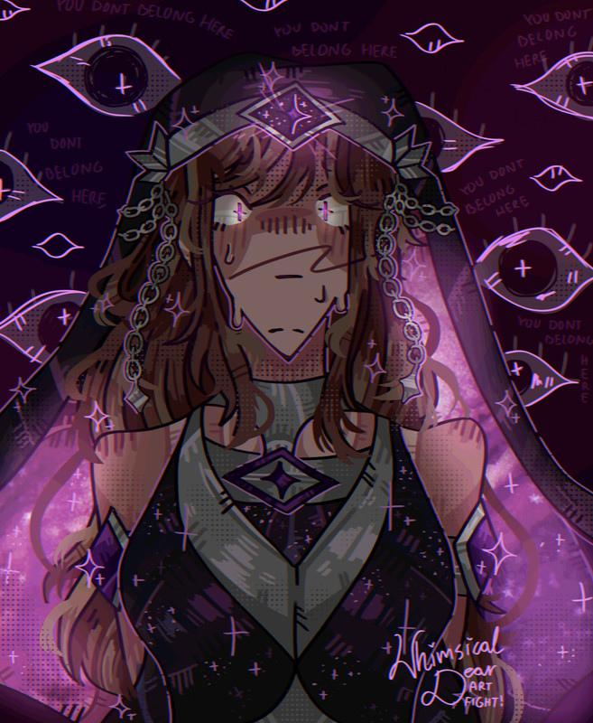
Wouldn't you like to know what happens next in this dream?
Please turn to the next page of this picture book no one has ever seen.
(I love the cage-shaped background)
-Galaxian-
Waiting by the window to revel in the last light of day.
Hoping that these empty halls are here to guide my way.
- Time
- Moderator
 Offline
- Registered: March 28, 2020
- Posts: 8,577
Re: An Amateur Artist's Art Array ~ Specter's art collection
sleeby
Time
Bruh the signature be wacky
- SpecterTheGreat
- Moderator
 Offline
- Registered: March 27, 2020
- Posts: 23,411
Re: An Amateur Artist's Art Array ~ Specter's art collection
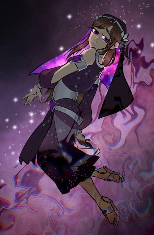
I have a bunch of wips and stuff I want to draw but instead I started this piece and focused on it.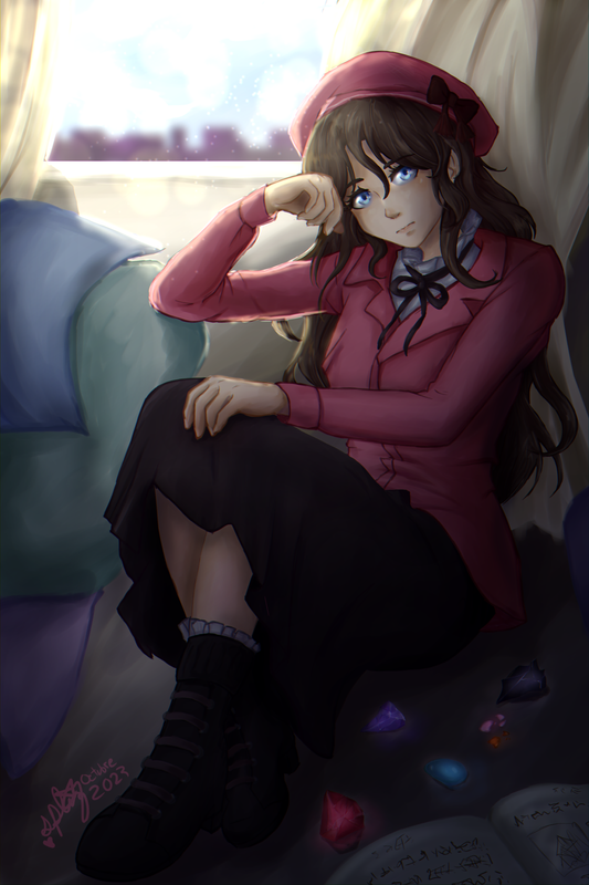
I heavily referenced this image for the pose and the general composition and atmosphere though I'm afraid the curtains didn't come out as nice as I would've wanted. I also referenced another image for the outfit but I can't find that one again.
I had a bunch of commentary in mind as I was working on this but I've forgotten most of it. Something noteworthy tho is that this is officially the largest canvas I've worked with and I found it to be a really good experience. I've yet to try it with other coloring styles, but I really liked that I had an easier time adding the details (even though this isn't a very detailed work). There was more room to work with in general even if the save time lagged exponentially.
The coloring is me still experimenting with the watercolor brushes because I love the texture. This time I pretty much did a lineless and then added borders on the same layer. I'm a bit sad that not all the colors can be clearly seen because of the light-dark effects I added on top but I also kinda like how that turned out! Another thing I played around with for the first time was chromatic aberration. I feel it adds a sort of "vibe" to the finished piece. However, testing it out with other sketches, I also found that it only looks good with larger canvas sizes. Otherwise it really does distort the colors.
Click here for the plain version:
Even though I like gems a lot I think I should probably brush up on how to draw them. And one last thing of note is that I was too lazy to write something on the book so I just scribbled whatever. Idk what it even is about.
Specter
When the imposter is sus
ඞඞඞ
- •
- Echowo
- Prince Peepaw of Darkness
 Offline
- From: STILL Stuck in Tennessee
- Registered: April 12, 2020
- Posts: 13,332
Re: An Amateur Artist's Art Array ~ Specter's art collection
OWO IT LOOKS SO PRETTY AAA
Edit: Forgot to add that I really like the style of rendering/shading you did
Last edited by Echowo (October 14, 2023 21:38:23)
✨️Echo✨️
he/him xe/xem
"If you are born weak, which god do you turn to for solace?"
"That's why... I had to become the
lone star
in the sky to guide them..."˙˚∘⊹☀️⊹∘˚˙
"I shall ascend to the heavens, becoming the scorching
sun...
Bathed in my light, my people shall flourish, while all evil shall be eradicated."
"I now permit you to stare into the sun."
- SpecterTheGreat
- Moderator
 Offline
- Registered: March 27, 2020
- Posts: 23,411
Re: An Amateur Artist's Art Array ~ Specter's art collection
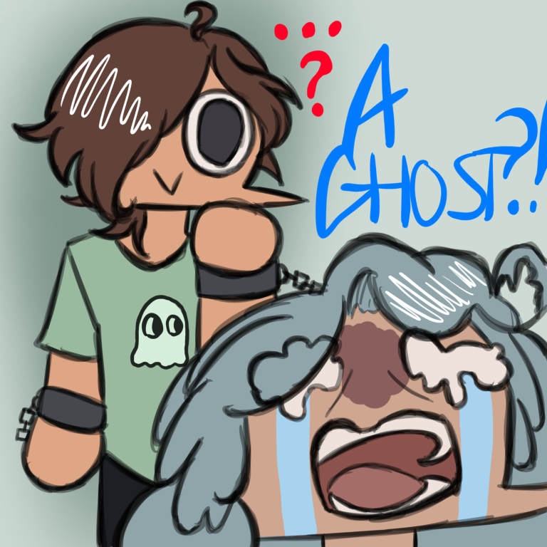
Sketch art moment. Just testing out brushes and stuff.
What's bro looking at? (He's looking at my pfp and judging me)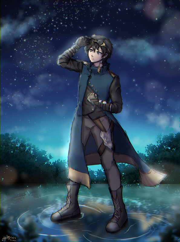
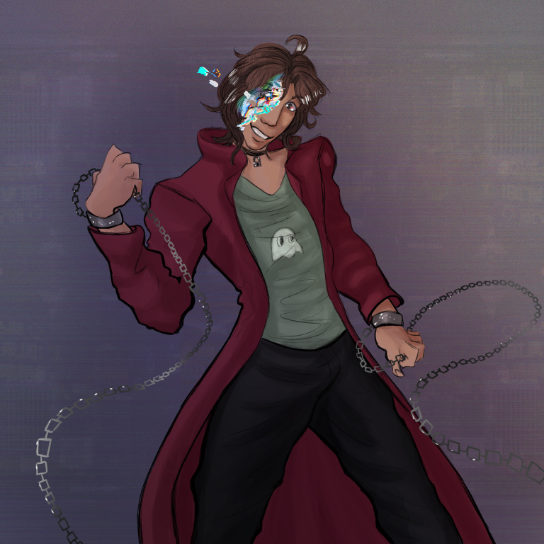
The piece I mentioned in my homethread. I originally drew him buff on accident but I fixed it later (a pity since it would've been nice to draw a buff character well for once, but welp, no problem) anddd it was fun to do the pose without references iirc since when drawing the sketch a pair of months ago I made a point to try to freehand the male body structure. It came out pretty well I suppose bc when I came back to it I didn't worry much about fixing things.
Anyways this is a bit of a lazy piece because the coloring is choppy and I didn't even do lineart, but I ended up focusing a bit more when I was doing the final touches. Even then you can see the airbrush shading and stuff and well like I said i was testing new brushes and new options.
I don't know what the context for this is, why is he out at night, why is he standing on water, why does the whole thing look like that idk I just thought it would be cool sooooo yup I think that's all I have to say. Fun piece. Good practice, I hope.
Btw @Time I didn't remember which arm was the black one so I just went with the one on his right. I hope it's okay lol.
Specter
When the imposter is sus
ඞඞඞ
- •
- Time
- Moderator
 Offline
- Registered: March 28, 2020
- Posts: 8,577
Re: An Amateur Artist's Art Array ~ Specter's art collection
SHEEEEEESHHHHH
That is GOOD.
Even tho you say it's lazy, I like it, as an avid lazy no-line-art artist myself.
Oh also btw I do think it is the right hand lol. I forget it a lot too.
Last edited by Time (December 3, 2023 00:26:00)
Time
Bruh the signature be wacky
- Echowo
- Prince Peepaw of Darkness
 Offline
- From: STILL Stuck in Tennessee
- Registered: April 12, 2020
- Posts: 13,332
Re: An Amateur Artist's Art Array ~ Specter's art collection
OOOOOO
I LIKE THE RENDERING, TASTY TASTY TASTY
ALSO I LIKE THE BACKGROUND AND WATER
✨️Echo✨️
he/him xe/xem
"If you are born weak, which god do you turn to for solace?"
"That's why... I had to become the
lone star
in the sky to guide them..."˙˚∘⊹☀️⊹∘˚˙
"I shall ascend to the heavens, becoming the scorching
sun...
Bathed in my light, my people shall flourish, while all evil shall be eradicated."
"I now permit you to stare into the sun."
- Echowo
- Prince Peepaw of Darkness
 Offline
- From: STILL Stuck in Tennessee
- Registered: April 12, 2020
- Posts: 13,332
Re: An Amateur Artist's Art Array ~ Specter's art collection
I forgot to say that I specifically like the reflection in the water!
And the airbrush looks nice, mmm texture
✨️Echo✨️
he/him xe/xem
"If you are born weak, which god do you turn to for solace?"
"That's why... I had to become the
lone star
in the sky to guide them..."˙˚∘⊹☀️⊹∘˚˙
"I shall ascend to the heavens, becoming the scorching
sun...
Bathed in my light, my people shall flourish, while all evil shall be eradicated."
"I now permit you to stare into the sun."
- Time
- Moderator
 Offline
- Registered: March 28, 2020
- Posts: 8,577
Re: An Amateur Artist's Art Array ~ Specter's art collection
rendering really just takes anything to a higher and greater level
Time
Bruh the signature be wacky
- SpecterTheGreat
- Moderator
 Offline
- Registered: March 27, 2020
- Posts: 23,411
Re: An Amateur Artist's Art Array ~ Specter's art collection
This is quite the late reply lol but I'm happy you guys like it! I'm pleased with how the piece turned out and I like the water reflection. Airbrush was just for shading and the reflection is with a new brush I'm testing out (does it matter in the end if I blurred the whole layer???) and the lighting on GGaD!Time. Really a lot of this is just seeing how to best use brushes and layer effects.
Something I wasn't sure about is if there was too much blue in the scene, and also I didn't want to take away from some lil details in the sky. Anyways, it was fun to do and a very instructive experience. Also @Time lol I'm sorry if there's design parts that aren't too accurate, I just sort of made up something to go on Time's leg since the ref didn't have that part visible bhfhf.
Specter
When the imposter is sus
ඞඞඞ
- •
- Time
- Moderator
 Offline
- Registered: March 28, 2020
- Posts: 8,577
Re: An Amateur Artist's Art Array ~ Specter's art collection
No I think the leg thing and design is overall accurate! The leg thing I think was supposed to be some sort of holster anyways iirc...?
Time
Bruh the signature be wacky
- SpecterTheGreat
- Moderator
 Offline
- Registered: March 27, 2020
- Posts: 23,411
Re: An Amateur Artist's Art Array ~ Specter's art collection
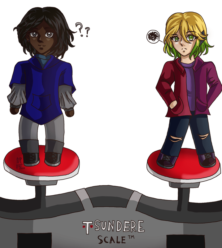
I had a crazy idea a few days ago, and it turned out to be kind of charming, I think. Usually I tend to focus on one or two characters at a time both when I'm drawing or devving...but what about the relationship between characters? How do they compare to each other in terms of design and art, and height? I wanted to find out and so I drew my F/DA AU characters all together to see how their heights look when compared to each other.
Partly posting it here because with how much I think about the AU I'm probably going to talk about it at some point in one of my threads and people will be confused without a lot of context so now you can be confused with a mental image for reference :3
Two important things to note:
1. If one or more of the characters reminds you of my GGaD characters it's because it's them. But the AU version. So, not the exact same, but the idea is there.
2. I speedran this thing because the idea was too intense and I wanted to get it done before tomorrow. So excuse proportion errors (I can see a bunch) because this was made for the general vibe of the characters. And yes I used flats because if I'd shaded, even with a multiply layer, this would have taken much more time and I was dying to finish it.
But the general quality is decent. I worked with the designs I have currently [Dec 14, 2023] because for starters some of these are WIPs that I will likely tweak a bit or a lot in the future. As of rn, I mostly like how they look. It was also a reason why I made this. I wanted to see how my characters' styles and physical appearances compared to each other when directly side by side. As you can see, it's pretty varied, and I like that.
Now onto some thoughts for the character art, left to right in order:
Ianthe - She turned out much more "emo" than I want her to look, but I really like the way that color palette fits her. So this is something I'll look into fixing, lol. Her outfit was fun to do even if it looks slightly bat-ish with her veil cape and stuff. Ianthe is the solid tallest out of my side of the F/DA cast but she almost always wears heels so??? I tried to level that out in the drawing by giving her the usual heels and marking her height at the point it really is. 175 cm.
Nyoko - I love dressing her up in clothes but I feel I could've done better with giving her a more iconic outfit here? The coat is very plain. She's so pretty though. As a fun note, I love giving her hats (berets especially) because it reminds me of how I used to draw GGaD!Bixbite with hats to cover her cat ears. No cat ears here (unfortunately?) but the beret looks super cute on Nyoko. Her shoes don't really have heels so that's her real height. Minus the hat.
Dion - Purple looks good on him ngl. I don't think I have many things to note about his design since it's pretty straightforward, but I guess his shoes are fun to do since I don't draw a lot of shoes like that. It feels like his outfit is much more casual than the other characters' and I like that.
Aisline - My favorite one to draw out of all my cast by far. She's so pretty and I really like the warm colors in her design, plus she pretty much always has an autumn vibe to her. It can't be seen from the front but her hair is in a bun. My note here is that I need to practice patterning for her clothes, and I like the thingy around her neck. Doesn't she look super nice and friendly? For some reason I feel she also looks a lot shorter than she is lol (especially at Dion's side).
Assassin - From here on there's class names (sort of like code names Ig) so none of the following are the characters' actual names. And hopefully this is noticeable but their clothes are supposed to be much more fantasy-oriented than practical. Anyways, I had the idea of doing poses that sort of fit with the characters' attitudes, and it was going pretty well and pretty tame until Assassin came in like HAHA POSE! and she took up more space than I had planned but it's all good cause look at how happy she is. I like the way her outfit colors contrast with her skin and hair and overall I think she looks pretty good. She's the second tallest in the whole group.
Caster - The shortest one in the cast but it's because he's a literal child (if we don't count him Aisline is the shortest one). Also why are children's proportions so hard to do? Whatever, Caster is super cute. Just look at his eyes. When desgining him I worked with the idea of making him slightly androgynous but I'm not sure if the result really shows that? I like the colors though, especially the variations between parts of his outfit that are white and gray and then much darker. Once again, I need to practice patterning. But he's really cute. I could squish his cheeks.
Lancer - Finally, poor Lancer, I've redesigned her outfit so so so many times. And I might continue doing it, who knows? But she's so purple. I love her. She might also be the most recognizable out of all the characters? Something to note is that I tried to toy around with the idea of assymetry in designs (because I always make everything too symmetrical, WHY?) and that's why she only has one arm covering. But then the rest is symmetrical again. She looks nice at least, and I struggle with her shoes a bit because I know she doesn't like closed shoes but I also didn't want to design her with plain sandals so this is what I settled on for now. I still can't draw feet though. Also, is it just me or is her design a bit too purple? She has her hair in a braid idk if it's visible.
It was super fun to do this even if it's a rushed work. I think what I got from this is that I tend to stick to a single color for characters (most noticeable in Aisline, Assassin, and Lancer) and then their clothes are just variations of it. I like how it turned out but maybe I should work on giving more highlights with different colors. It was interesting to see the height comparison too because I tend to draw the characters by themselves and they look just fine, they look normal. But when placed next to others, the design changes slightly xD I noticed this with Aisline and Caster especially since they're so tiny and Caster just looks TINY TINY next to the others. Anyways, super cool! I forgot what else I wanted to say hehe but yeah.
Specter
When the imposter is sus
ඞඞඞ
- •
- Echowo
- Prince Peepaw of Darkness
 Offline
- From: STILL Stuck in Tennessee
- Registered: April 12, 2020
- Posts: 13,332
Re: An Amateur Artist's Art Array ~ Specter's art collection
OHHH TIME FOR FANART CENTRAL BABEYYYYYYY
Also owo designs <3
Last edited by Echowo (December 14, 2023 13:26:44)
✨️Echo✨️
he/him xe/xem
"If you are born weak, which god do you turn to for solace?"
"That's why... I had to become the
lone star
in the sky to guide them..."˙˚∘⊹☀️⊹∘˚˙
"I shall ascend to the heavens, becoming the scorching
sun...
Bathed in my light, my people shall flourish, while all evil shall be eradicated."
"I now permit you to stare into the sun."
- SpecterTheGreat
- Moderator
 Offline
- Registered: March 27, 2020
- Posts: 23,411
Re: An Amateur Artist's Art Array ~ Specter's art collection
It's been a while since I last posted something huh
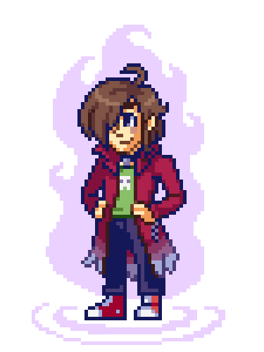
Anyways this is something I did rq for a character appearance update for a server I'm in. His name is Valère (or Val for short) and he used to have his hair dyed black but he took the dye off and restyled his hair with another character's help. So I took the chance and did a fullbody of him for the first time.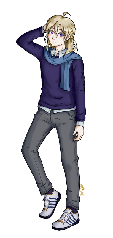
I think I haven't done any fullbody renders since last year tbh. I had to use Medibang instead of CSP for reasons this time but I think I did pretty well even though I didn't have the custom CSP brushes available. I'm trying to figure out if this is a viable way to do shading. I originally tried for hard cel-shading but I find myself always falling back into the airbrush habit (and also I seem to be too shy when adding shading for some reason??? help???), so I guess I'll have to figure something out? Despite errors here and there I think the png result looks pretty cool.
So yeah. Don't want to leave this thread without updates now and then. I'll see if I can pick up some other projects with Medibang and finally get back into the drawing habit again, but only time will tell.
Specter
When the imposter is sus
ඞඞඞ
- •
- Echowo
- Prince Peepaw of Darkness
 Offline
- From: STILL Stuck in Tennessee
- Registered: April 12, 2020
- Posts: 13,332
Re: An Amateur Artist's Art Array ~ Specter's art collection
OWO PRETTY
✨️Echo✨️
he/him xe/xem
"If you are born weak, which god do you turn to for solace?"
"That's why... I had to become the
lone star
in the sky to guide them..."˙˚∘⊹☀️⊹∘˚˙
"I shall ascend to the heavens, becoming the scorching
sun...
Bathed in my light, my people shall flourish, while all evil shall be eradicated."
"I now permit you to stare into the sun."
- Time
- Moderator
 Offline
- Registered: March 28, 2020
- Posts: 8,577
Re: An Amateur Artist's Art Array ~ Specter's art collection
NICE 👍
SpecterTheGreat wrote:
and also I seem to be too shy when adding shading for some reason??? help???
I've noticed that I'm also too timid when it comes to taking more risks in shading. I guess the only way to find out what works and what doesn't it to just take the leap and trust the process, you know?
Time
Bruh the signature be wacky
- Echowo
- Prince Peepaw of Darkness
 Offline
- From: STILL Stuck in Tennessee
- Registered: April 12, 2020
- Posts: 13,332
Re: An Amateur Artist's Art Array ~ Specter's art collection
Time wrote:
NICE 👍
SpecterTheGreat wrote:
and also I seem to be too shy when adding shading for some reason??? help???
I've noticed that I'm also too timid when it comes to taking more risks in shading. I guess the only way to find out what works and what doesn't it to just take the leap and trust the process, you know?
Agree! Sometimes you gotta do something DRAMATIC, but also you have to have fun
Sometimes studying other's art and shading styles help too (^v^)b
Also the colors are very nice here owo
✨️Echo✨️
he/him xe/xem
"If you are born weak, which god do you turn to for solace?"
"That's why... I had to become the
lone star
in the sky to guide them..."˙˚∘⊹☀️⊹∘˚˙
"I shall ascend to the heavens, becoming the scorching
sun...
Bathed in my light, my people shall flourish, while all evil shall be eradicated."
"I now permit you to stare into the sun."
- SpecterTheGreat
- Moderator
 Offline
- Registered: March 27, 2020
- Posts: 23,411
Re: An Amateur Artist's Art Array ~ Specter's art collection
Finally done with this: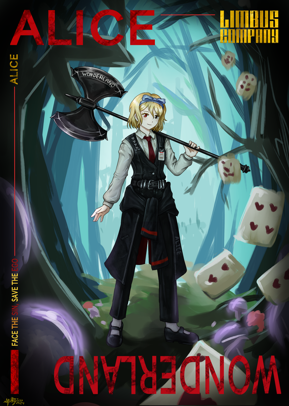
ALICE
Particulars: Excessively imaginative, wanderlusted
Despite her penchant for threatening to behead others at the slightest inconvenience, this Sinner is relatively harmless and compliant. Her unconventional way of interpreting situations may provide insight when faced with puzzling circumstances as much as it can complicate the simplest of exchanges. It is at your discretion to ignore her unrequested ramblings to keep confusion from spreading among the team. She brings with her a frankly strange combat style, but once the other sinners learn to avoid her wild swings, she can serve as an element of surprise for unsuspecting opponents. Be sure to never leave her unsupervised—her tendency to wander off at the slightest distraction combined with a nonexistent sense of direction may result in having to take time off the current mission to bring her back.
~
Soo, Limbus OC time! I love my Alice even if she’s a little loopy haha.
Her story is not 100% defined because there’s still a bunch of in-universe lore that I don’t know but I hope to eventually have her fit perfectly into The City’s lore. Even then, I’ve had lots of fun thinking up ideas and possibilities (thanks to Time for helping me craft the character) and figuring out character design.
Anyways, as you can see, I attempted to imitate the official style for Limbus Company. I think I did just okay, though the hardest part by far was the coloring and even then I don’t think I got that down too well. Still, though, if you take it as an imitation, I’m proud of how it turned out. It’s been a very long time since I last drew that tiny little nose and the one line for the mouth lol. And I could not elongate the legs enough. But that’s okay.
Too late while coloring I noticed that the official artist uses a different kind of thicker colored lineart, while I went for thin lines everywhere. My own style is a little bit more “organic” and I think I didn’t get to capture the blocky line style quite right, but I tried with the hands.
As for coloring… whew. Lots of trial and error. Mostly error. I started out with base colors that were way too dark, and I severely underestimated the lighting part. So I ended up having to fix a lot of things as I went along, though this did make me notice that there is a LOT of texture contained in a few simple strokes of shading (and lighting). Like for example I can now tell that the vest is probably made of leather from the way it shines, while the shirts are supposed to be stiff but still wrinkly. There’s a lot of textured wrinkles all over the clothes, and I was very doubtful of this at first but it did end up giving it a lot of life once it was done.
And as a random note, I usually work with my “grayscale” leaning towards blue. Here a lot of the darker shades instead were orange-ish and that was very… weird to work with for me. Still though I feel like I've learned a lot about clothing shading from working on this. Now whether I'll be able to use the learned knowledge or not is another thing (especially with how time-consuming this was) but lol.
I really like the way the sharp bladed weapons are colored because it feels like it somehow highlights the sharpness with just a few strokes of lighter gray.
For the background idk I can’t really say a lot because I honestly had something in mind and I wanted to get it done. I played around with a default brush I found because it has TEXTURE so yeah that’s what I used? I very nearly color-switched the whole background to shades of red and darker red because red (along with gray and black) seems to be the main color in Limbus character background, but then I realized. I can make it cyanish blue, because this is supposed to represent Wonderland, and that’s a place that’s separated from The City. Besides this shade of green seems to be used for fairy-related Abnormalities so why not? Gives it a sense of separation, otherworldliness when compared to the bleak and bloody City.
Not that this Wonderland is a happy utopia either, but…you get the idea.
Click here for the PNG version of Alice:
Specter
When the imposter is sus
ඞඞඞ
- •
- Echowo
- Prince Peepaw of Darkness
 Offline
- From: STILL Stuck in Tennessee
- Registered: April 12, 2020
- Posts: 13,332
Re: An Amateur Artist's Art Array ~ Specter's art collection
BRO THIS IS SO HQBSBABDBQJJDJQ OWO LIKE THE BACKGROUND, THE FOREGROUND, THE EVERYTHING?
✨️Echo✨️
he/him xe/xem
"If you are born weak, which god do you turn to for solace?"
"That's why... I had to become the
lone star
in the sky to guide them..."˙˚∘⊹☀️⊹∘˚˙
"I shall ascend to the heavens, becoming the scorching
sun...
Bathed in my light, my people shall flourish, while all evil shall be eradicated."
"I now permit you to stare into the sun."
- Time
- Moderator
 Offline
- Registered: March 28, 2020
- Posts: 8,577
Re: An Amateur Artist's Art Array ~ Specter's art collection
WE MAKING IT TO WONDERLAND WITH THIS ONE 🗣️🗣️🗣️
Super epic! I love the details, especially the reflecting light on the weapon! I can't put all my thoughts down yet, but I will do so soon!
Time
Bruh the signature be wacky
- LazyOwlViolet
- Forumer
 Offline
- From: Genesis
- Registered: August 29, 2023
- Posts: 695
Re: An Amateur Artist's Art Array ~ Specter's art collection
HOLY WOW
this is so pretty I love your art style just WOW
This look like a poster or a book cover it’s SO GOOD
they/them
you can call me Vio
too lazy to put something here
sun and moon brainrot
- SpecterTheGreat
- Moderator
 Offline
- Registered: March 27, 2020
- Posts: 23,411
Re: An Amateur Artist's Art Array ~ Specter's art collection
Thank you guys 💖 I mentioned this up there but this is me trying to imitate another artist's style. Even then though if you don't look at it as an imitation, I have to admit I'm proud of how it turned out ;P
Specter
When the imposter is sus
ඞඞඞ
- •
- SpecterTheGreat
- Moderator
 Offline
- Registered: March 27, 2020
- Posts: 23,411
Re: An Amateur Artist's Art Array ~ Specter's art collection
Artfight 2024 has ended and it's time to show off all the art I got!
I received 15 attacks in total, 6 of which were revenges. However, 2 characters on my page were also included in other attacks, so that'd be 17 in total.
I had 8 characters up on my page this year. Let's see the art!
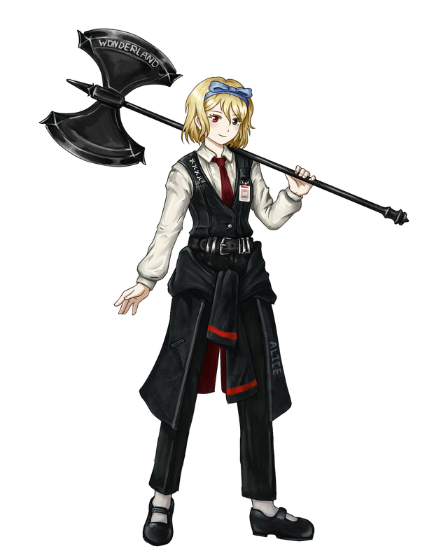
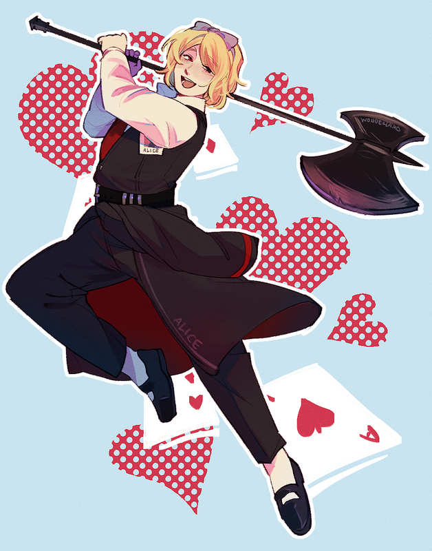
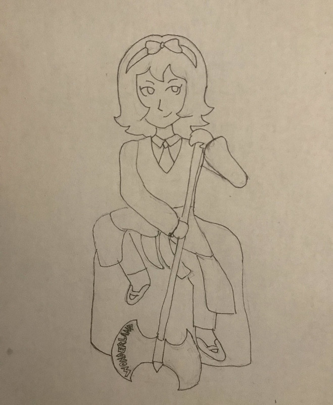
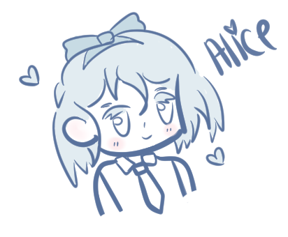
ALICE
parle à ta téte by iocasteo
Alice by Shark-Bait
alice scrib by meromerochange
alialii by naivecyan
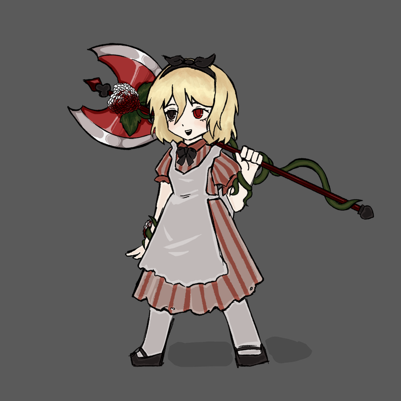
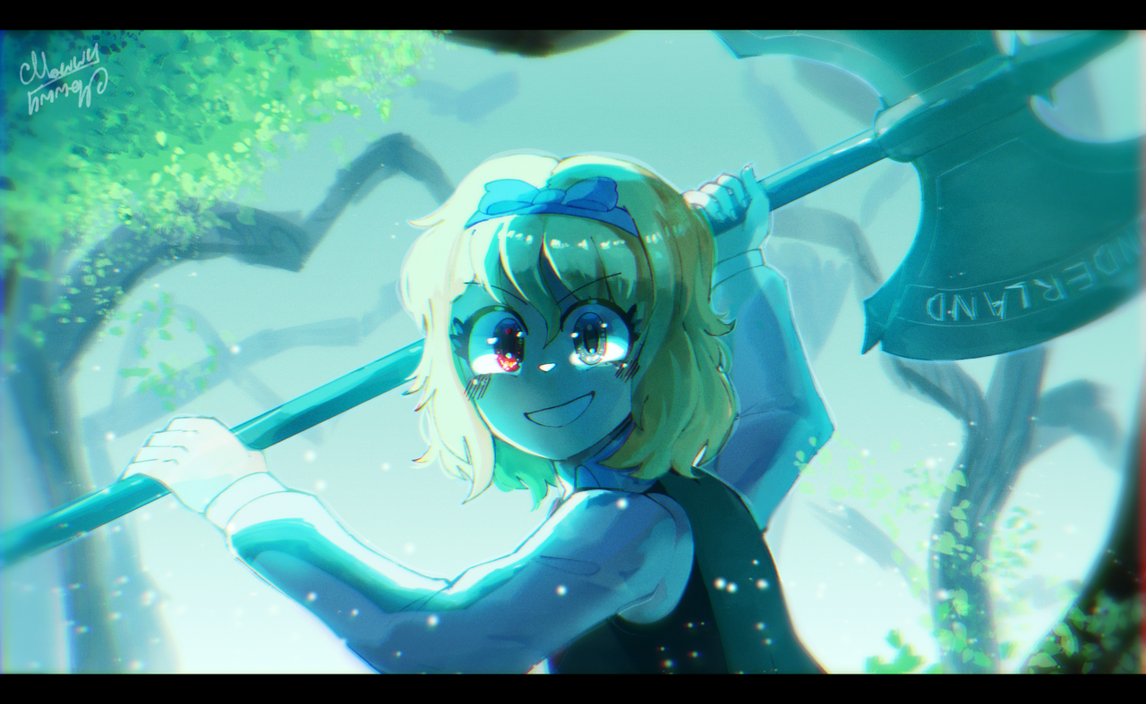
Alice! by MawwyMawwy
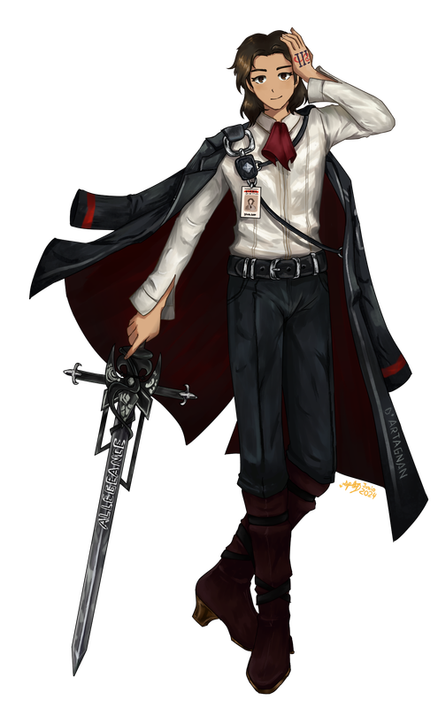
D'ARTAGNAN (this character belongs to Tuti)
Page art (drawn by me for the character page)
"Pass On" AKA The Hell of My Last Few Weeks by sprightly
The design belongs to Tuti I only drew it.
DION
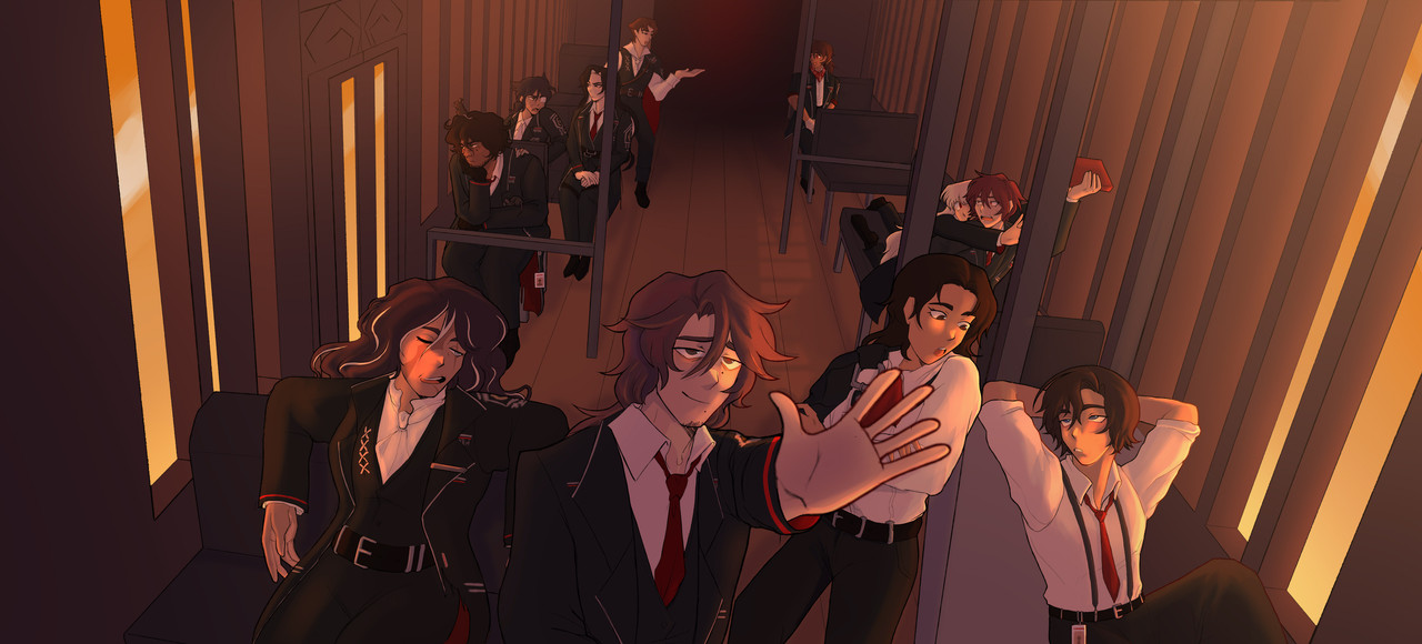
D'artagnan is featured in the center right talking with the character on the far right!
Contest of Scales by Galaxian
SPECTER
I'm pretty sure we all know who Dion is here xD (he's on the right)
Pix-Specter by Riccaby
OoooOoooOoooo by Echo
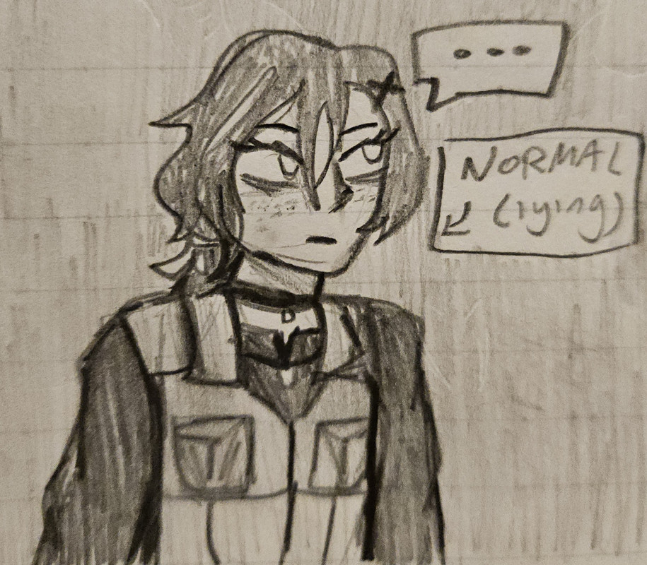
BOO! also by Echo
I really love love love the vibes on this one, epic work Echo!
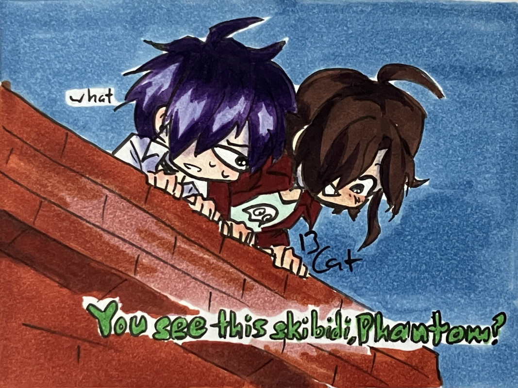
You see this skibidi, Phantom? by Eliza
EMMOT MISTI
I just have to say I absolutely love this one because of how Specter-like it is just please don't let Specter into the internet of this age
guys hes fine i promise by starrynite
XAPHAN MISTI
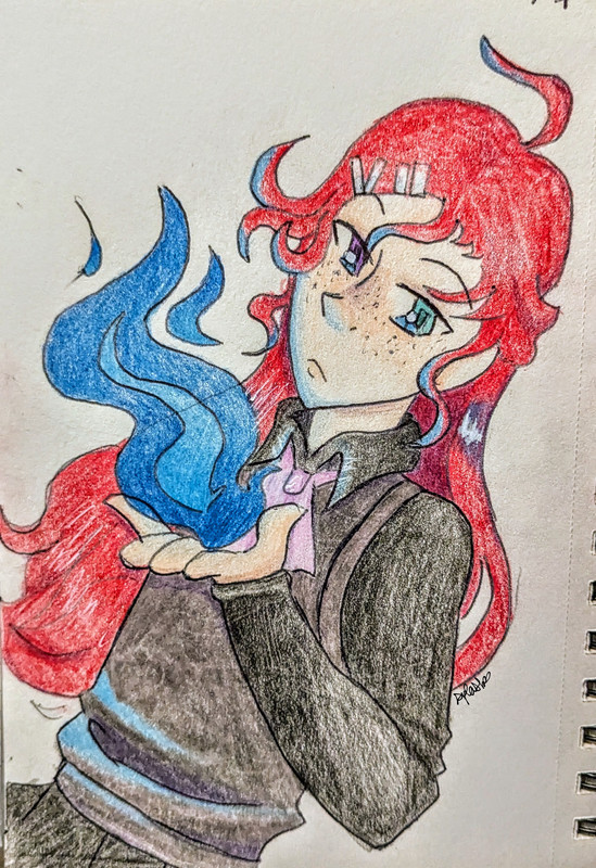
...fire? by Splashheart8
Have A Smile! by Lasercraft32
YVONNE
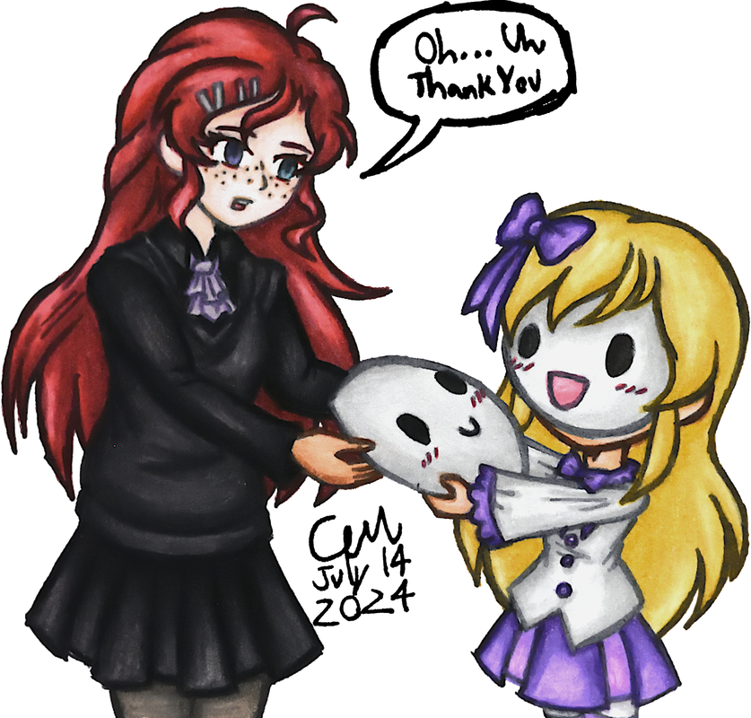
Yvonne!! by Whimsicaldear
Yvonne by Anastasiia
ALLEGRO CAMPANELLA
Genuinely sad I didn't have enough creativity to revenge this amazing piece of art 😔 it's ok though I'll try to get the artist next year
或许七年流逝只是一瞬间 by Galaxian
So, that's a wrap! I'm super happy to have gotten this many attacks and they're eye candy for me, they're all amazing and I love every single one of them so much.
When I saw this one I started screaming and crying (not literally) and I think it's my favorite of all the ones I received this year because of how much of the character's story is incorporated into just one gif 💛
Alice and Specter turned out to be surprisingly popular but I'm not complaining! I wish more people had drawn Dion, but then again I am aware that the more characters I have on my page (and I still plan to add more), the less attacks per character I'll get because they all get kind of spread out.
Specter
When the imposter is sus
ඞඞඞ
- •
- SpecterTheGreat
- Moderator
 Offline
- Registered: March 27, 2020
- Posts: 23,411
Re: An Amateur Artist's Art Array ~ Specter's art collection
Time to share the art I did! I think a lot of you have been following my progress but I'm putting it out here anyways.
I made a grand total of 21 attacks (same number as last year wow???) of which 6 were revenges. I have 2 revenges pending for next year, but by then they'll probably count as attacks lol.
A silly (for Whimsicaldear)
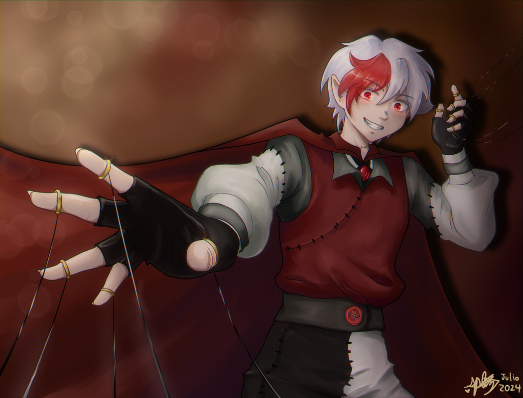
Puppeteer (for Eliza)
Character: Silias
I really loved making this one, I did it on a total whim because I hadn't really planned anything out, and despite being my first attack I absolutely love the vibe of how it turned out. Yellow vibes gogogo!
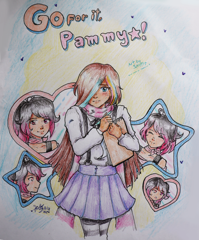
Go for it, Pammy! (for aquaphina)
Character: Noxire
Challenged myself with the posing here. I've never been good at foreshortening, so I just used the strategy I tend to do when doing poses: use myself as a reference. And it turned out good! I'm kinda disappointed with the lack of creativity for the background, but I'm super proud of the pose. Also as an interesting note, you can see the nails on the hands, which is something I don't usually detail.
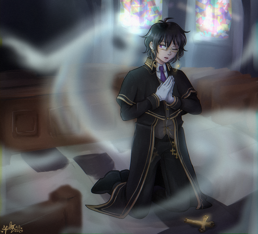
Interrupted prayer (for leedle)
Characters: Pammy Star and Ayano Yukimura
Idk what to say about this one I had it stuck in my head since last Artfight. I guess I'm glad it turned out cool lol.
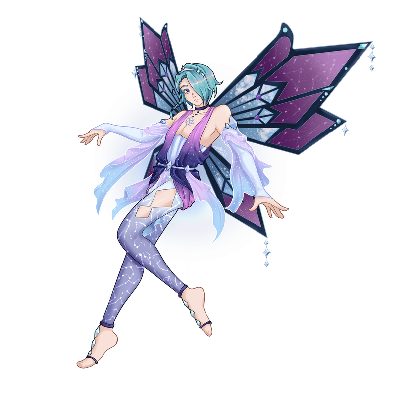
Enchantix (for akiichu)
Character: Lucifer Blackwood
I particularly like the background for this one, but more in idea than in how it turned out. I really need to learn a lot about lighting, and the strokes for the background are rough and not detailed. Still, I like the vibe of this. It was surprisingly quick, like 3 hours only? I honestly surprised myself with this, plus I did it in one sitting. Some details are missing, like I forgot to add the lighting on the lineart, but it's ok.
Little friend (for Lasercraft32)
Character: Lucius
Obligatory femboy art /j. I never talk about Winx but I like the fairy designs from the show and so it was super fun to browse around the fan characters. The colors in this were delightful to draw, even if a pain to to shade lol.
Disciplining hammer (for iocasteo)
Character: Megan Kakorrha
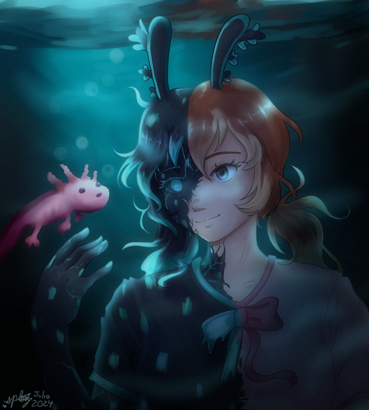
Let's ignore the horribly drawn axolotl honestly and focus on the fact that I tried to do an aquatic scene which didn't turn out that well but it gives the correct vibes so I like it. This is a Minecraft oc I had in my sights since last year and I'm very happy I was able to draw her this time.
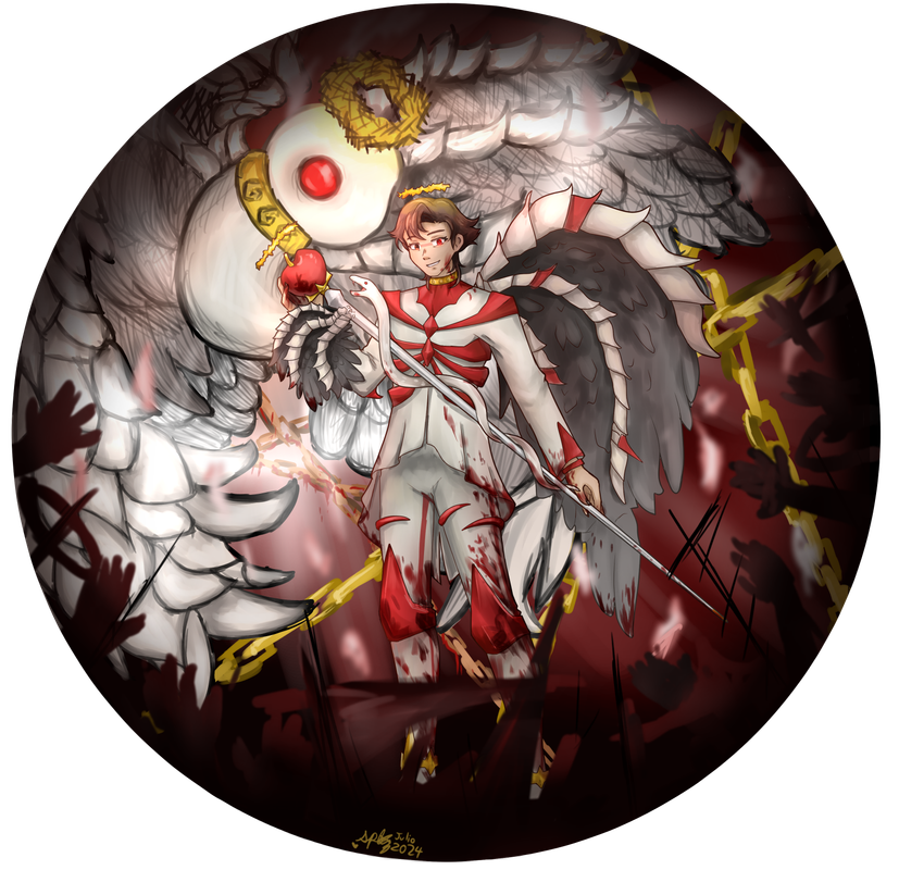
Figurine #1 (for Chan)
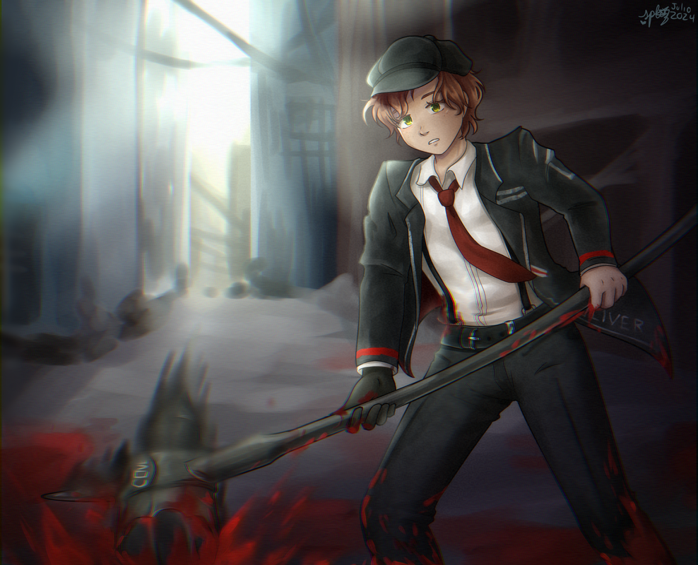
Character: Oliver Twist
Limbus OC time!! I couldn't not draw this lil guy tbh I like his book. Highlight here is the weapon, getting the angle right was o hard and yeah idk I streamed this to some friends so credit to them for helping me figure out the lighting and the details on the blood splatter. I'm definitely going to work on background lighting for next Artfight.
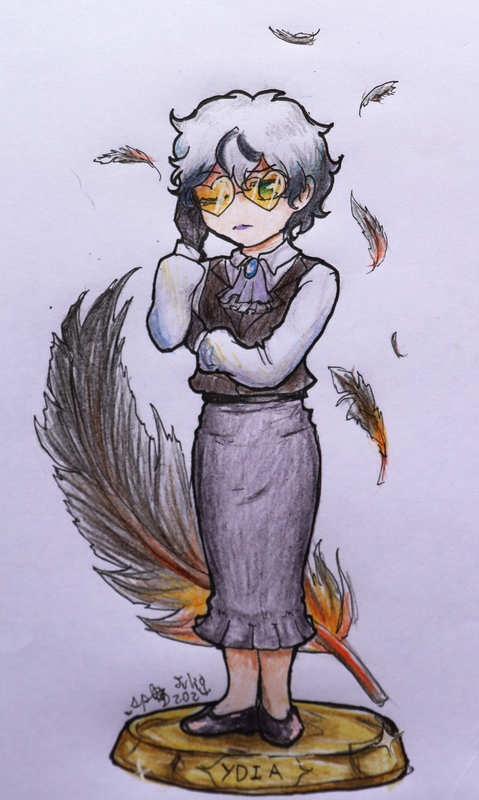
Figurine #2 (for starrynite)
Character: Ydia
The first of a set of chibis I wanted to do as if they were figurines + something representative of the characteri n the background. I just thought it would be cool.
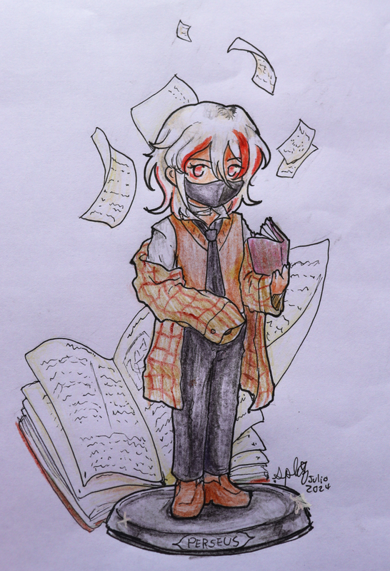
Figurine #3 (for amesical)
Character: Perseus
Shading light colors like white or cream on paper is so hecking hard.
Figurine #4 (for Autumn)
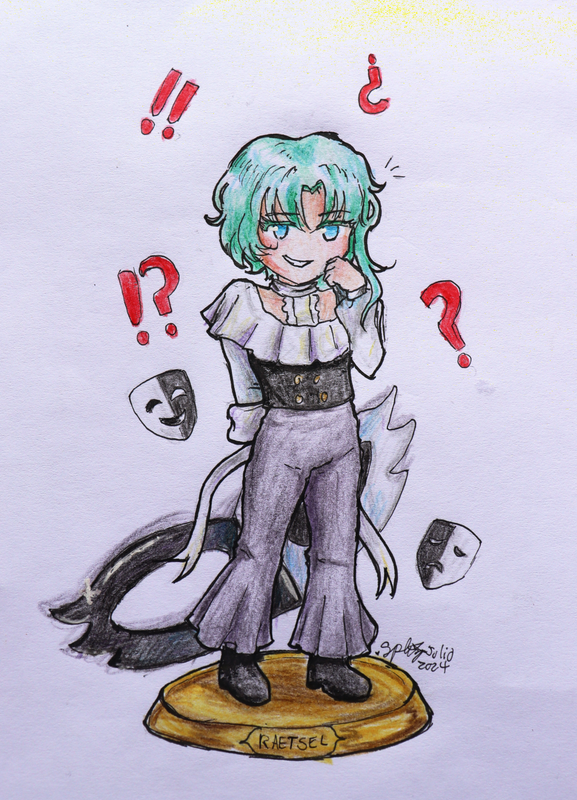
Character: Raetsel
Black and darker colors are just as hard to shade as white. Here I tried adding some accent colors and idk how it turned out I just hope they don't make the white look like another color.
Naoko :3 (for aromanticism)
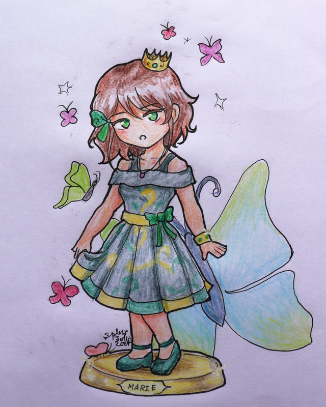
Character: Marie
I really liked the character vibes so I wanted to draw her.
Invernadero [Greenhouse] (for Onikofi)
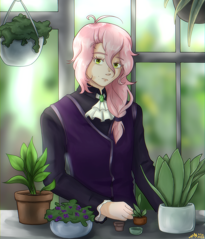
Character: Naoko
This lil guy wasn't on my priority list (you can see this is very doodle-y compared to the previous pieces) but I accidentally marked down the priority count and so yeah I just stuck with that and deleted another character off my list. Which was okay because at this point Artfight was one week away from ending and I was running against the time to get my revenges done. Either way I did want to draw this character a lot so yeah.
Complaint (for Galaxian)
Character: Victor Seabury
Plants!! Deceivingly hard and time-consuming to draw, so much so that I had to remove a couple that I had in the initial step. But it turned out fine and I'm particularly proud of the one in the lower right corner. This piece was marked as having a scene background and that's because it did, I just blurred it a lot to get the feel of distance and... yeah it probably wasn't that good of an idea to pretty much delete all my work just like that but lol. I really didn't do the metallic part too werll either but I liked how the rest went and I did put a lot of time into this piece as well.
Penelope (revenge for meromerochange)
Characters: Rai and Dion
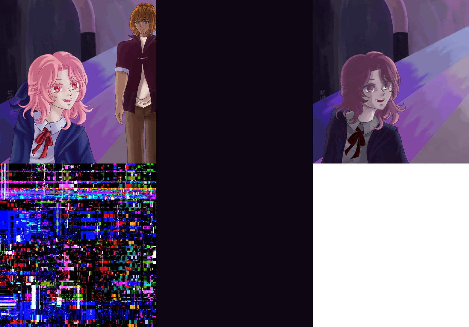
Idk what to say about this one xD it was fun to make with all the props and stuff but I have to be careful on how I fix the colors and balances in photo editing, because Dion's shirt looks pink while irl it's actually maroon. Shading dark colors, as always, is very hard for me on paper.
Mysterious beauty (revenge for Shark-Bait)
Character: Penelope
Chibi moment (I almost forgot the lines under her eyes)
Chili (revenge for Echo)
Character: Kalma
I experimented with airbrushing the skin color on top of the bangs for added texture and I think I like how it turned out. Aside from that this is just a regular sketch for me, nothing especial (I struggle detailing lips).
Greetings (revenge for Riccaby)
Characters: Seis and his grandpa
A big apology to Echo's characters for whatever this is but I just had to. I really had to xD. Also, this is the only piece in Artfight I shaded with a multiply layer, but it was for the sake of time because no way I was going to lineart this and do special coloring xD it was super fun to do though.
Ready for a picture? (revenge for Splashheart8)
Character: Nilla Aferson
Chibi moment! I tried my best to adjust the chibi style to her body type and I'm not sure if I succeeded but the important thing is that I tried my best. The hair was super fun to do (I love orange haired characters).
Burn! (revenge for MawwyMawwy)
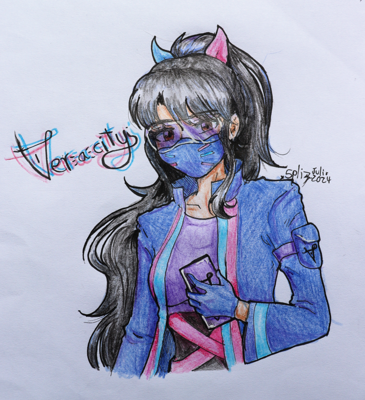
Character: Veracity
This one was super fun to do as well, especially layering the colors on the google part. The hair was fun to draw but hard to color, and I forgot to draw the phone's camera but overall I really liked how this one turned out!
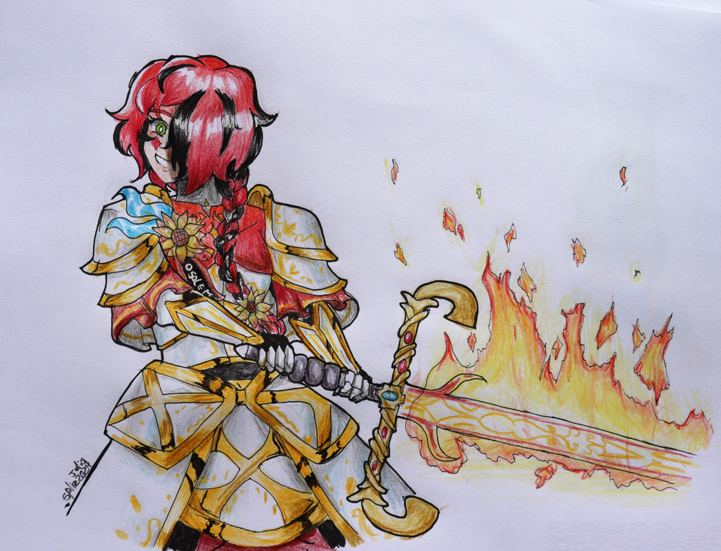
Paradise Lost (for Twigsagi)
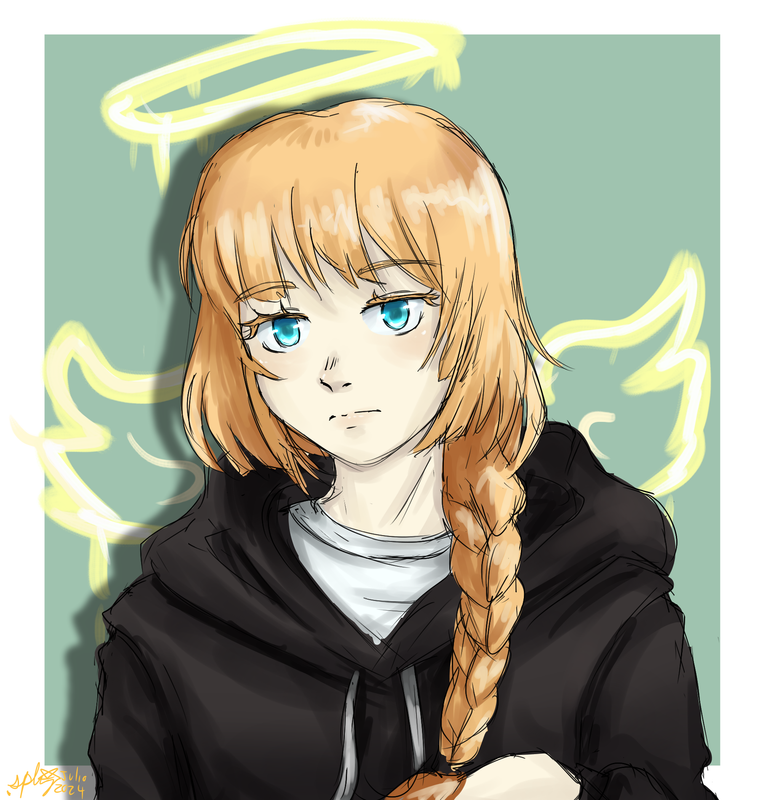
Character: Soleil di Lucia
This is probably hands down the best thing I've drawn on paper this year. I can't believe that I truly managed to include all the details in the character design, and this isn't a fullbody. The sketch was super chaotic with things overlapping but once it got linearted, clarity came. I forgot that with colored pencils I tend to shade first and color later, so that made my life a lot harder while trying to color because the shading wouldn't stick... still the fire was fun to do, I really like this set of colors. Armor is hard for me, but this wasa very fun excercise and I'm super proud of how this turned out.
Overall, I met my goals for the year. I succeeded at using my new lineart style and coloring mostly like I wanted, though I still have to learn how to edit colors with lighting. I also did hand-picked shading for all of these (one of my goals was to not use mutiply layers for shading) except two which were more sketch-like and it allowed me to experiment a little tiny bit with lighting as well as shading. I did use a lot of multiply and add layers to set the tone for backgrounds and scenes, but that's fine, and I think it looked cool in the end. Plus I've been trying to use the chromatic aberration for an extra finish.
Character: Lucifer
Fanmade Whitenight EGO for Limbus Company at its finest. I have a lot to say about this one but maybe for that just check my attack's description on its page. It was such a journey to do this, took me literally the whole month and I went through a lot of ideas, and I thank Echo Galaxian and Tuti for helping me out with this. There are a lot of details I think and the process was so hard that I almost deleted the unifnished canvas, but I decided to push on and lineart and color and then when I rendered... I was proud of this.
Check out this link for the full quality picture and assets!
And do check out the lore for this character, the owner wrote A LOT of lore for him and it was extremely fun to read through.
Everything was done completely in Medibang paint.
All in all I declare this a successful Artfight and I look forward to participating next year again if it's possible!
Specter
When the imposter is sus
ඞඞඞ
- •
- Time
- Moderator
 Offline
- Registered: March 28, 2020
- Posts: 8,577
Re: An Amateur Artist's Art Array ~ Specter's art collection
Wow yeah I totally forgot to exactly comment here since I've basically seen all of these as a spectator and all.
BUT I feel this year's works were pretty cool! It seem's Alice was quite popular for her debut. For me my favorite on from the attackers has gotta be "parle à ta téte" by iocasteo. The pose is pretty fun for sure.
"alialii" by naivecyan is pretty nice for mimicing PMoon's sprite style
and "Alice!" by MawwyMawwy has quite the nice amount of fog and filters with all that blue lighting that makes me like it lol.
On your end, you know Paradise Lost has to be the standout for sure. But to break away and give appreciation to another piece that I like your piece for Noxire! Very very cool posing and stuff.
Time
Bruh the signature be wacky
- Echowo
- Prince Peepaw of Darkness
 Offline
- From: STILL Stuck in Tennessee
- Registered: April 12, 2020
- Posts: 13,332
Re: An Amateur Artist's Art Array ~ Specter's art collection
I still love the revenge you drew for me XD it makes me giggle each time
✨️Echo✨️
he/him xe/xem
"If you are born weak, which god do you turn to for solace?"
"That's why... I had to become the
lone star
in the sky to guide them..."˙˚∘⊹☀️⊹∘˚˙
"I shall ascend to the heavens, becoming the scorching
sun...
Bathed in my light, my people shall flourish, while all evil shall be eradicated."
"I now permit you to stare into the sun."
- SpecterTheGreat
- Moderator
 Offline
- Registered: March 27, 2020
- Posts: 23,411
Re: An Amateur Artist's Art Array ~ Specter's art collection
@Time
I think bro is biased towards Limbus fan characters xD I'm glad you liked the pieces though and I'm sure it was fun to be an spectator!
@Echo
chili moment xD
Specter
When the imposter is sus
ඞඞඞ
- •
- GalaxianExplosion
- Freezing Water in Mouth
 Offline
- Registered: March 27, 2020
- Posts: 26,696
Re: An Amateur Artist's Art Array ~ Specter's art collection
Congrats for a job well done on all your attacks/revenges and for completing ArtFight in general! It was a bunch of fun to stalk your profile throughout the event lol
I thought it was to be expected that Alice was popular (and Specter too, they have a very cool design). I'm also glad I got in that attack on Dion, since I think he'd feel left out if he isn't drawn at least once when everyone else is (this is just me teasing him sorry). I'm a lil sad that I wasn't able to sketch D'Artagnan, but tbh I don't know enough about the 3 Musketeers beyond the chocolate brand, so I'm really glad he got included in a group attack. The attacks on you were really fun to watch, and it even felt kinda like I was getting double-attacked as well since I know some of the characters fairly well.
Without regurgitating all of my reactions to the your attacks, I really enjoyed all the different vibes you experimented with, and I think you did a really good job with them. Thank you again for drawing Dion and Rai, they're so funny together xD. I'll be looking forward to at least spectating the next year too!
-Galaxian-
Waiting by the window to revel in the last light of day.
Hoping that these empty halls are here to guide my way.
- SpecterTheGreat
- Moderator
 Offline
- Registered: March 27, 2020
- Posts: 23,411
Re: An Amateur Artist's Art Array ~ Specter's art collection
Thank you and I'm glad you enjoyed viewing my profile! I think mostly I was surprised about Alice since she was a recent addition to my profile while other characters had been there for longer. But I'm glad to receive art anyways haha
Getting double attacked from your part was something I definitely did not expect but it WAS fun to get that Dion art the very last day 💖
Specter
When the imposter is sus
ඞඞඞ
- •
- SpecterTheGreat
- Moderator
 Offline
- Registered: March 27, 2020
- Posts: 23,411
Re: An Amateur Artist's Art Array ~ Specter's art collection
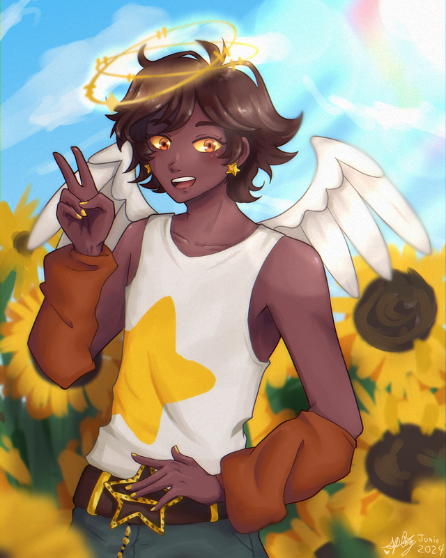
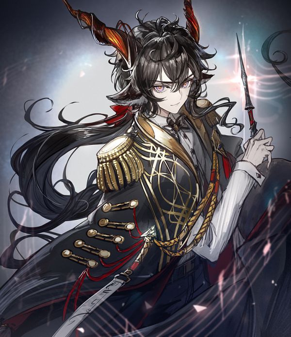
Say hi to Dante from Daybreak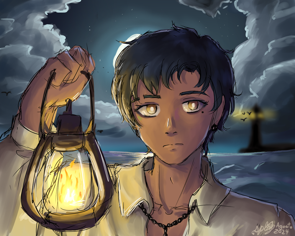
Genuinely so mad that what was supposed to be a casual fanart doodle turned out so cool but at the same time I'm proud of the result so xD let's see if I can keep up this quality for some art that isn't fanart.
Anyways experimenting with light and shadow colors. It wasn't supposed to be rendered I just did it on a whim...
but I knew I was going to crack and do Daybreak fanart at some point so yay? This guy is one of my favorites in-game because of his voicelines and his lore is fun too (and he's Spanish). Maybe I should draw him in his alternate universe superhero self skin as well.
All things aside I actually really like how the facial structure came out and the way the light and shadows make it clearer.
Specter
When the imposter is sus
ඞඞඞ
- •


