- SpecterTheGreat
- Moderator
 Offline
- Registered: March 27, 2020
- Posts: 23,417
Re: Time finally decides to make one of these - An art thread
Now that you mention it I can make out the Americas. Previously I thought it was an unknown planet hahajhf
Specter
When the imposter is sus
ඞඞඞ
- Time
- Moderator
 Offline
- Registered: March 28, 2020
- Posts: 8,584
Re: Time finally decides to make one of these - An art thread
yeah, if I wanted to I should have made it easier to recognize to piece things together more easily.
Time
Bruh the signature be wacky
- •
- Time
- Moderator
 Offline
- Registered: March 28, 2020
- Posts: 8,584
Re: Time finally decides to make one of these - An art thread
WIPs that I will most likely NEVER be FINISHING
I'll spoil them because they can be big
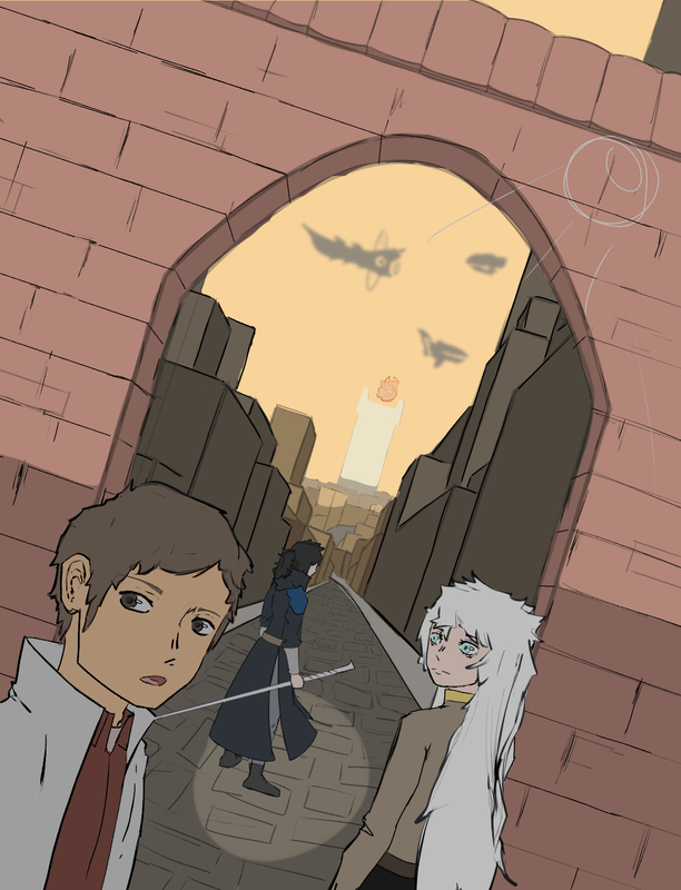
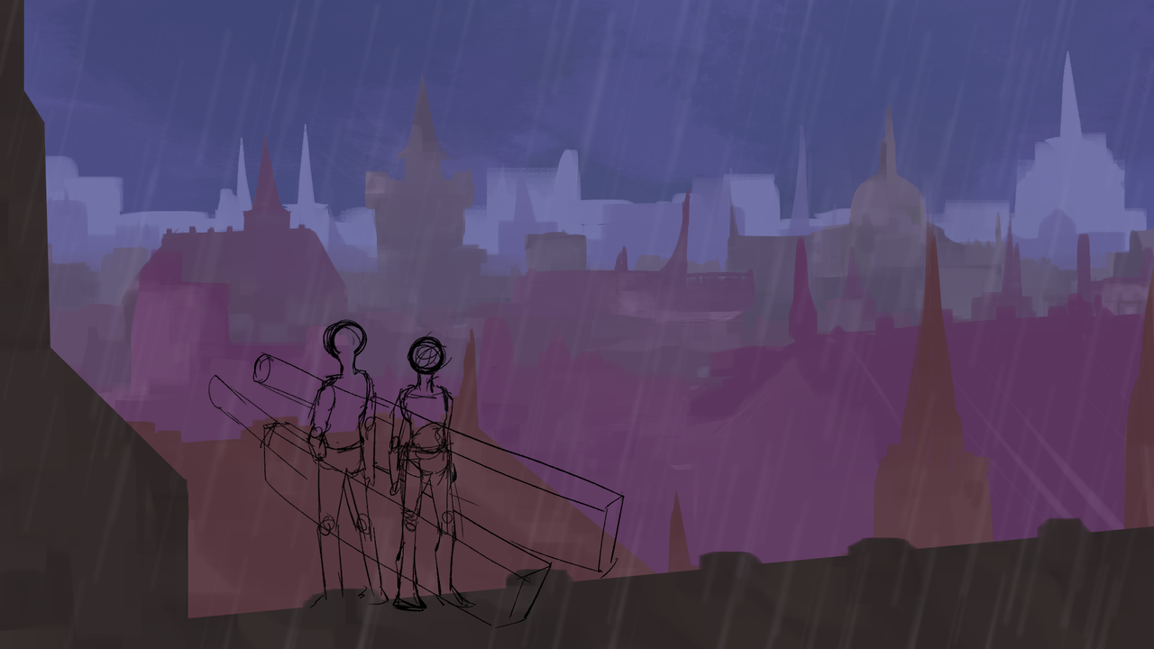
I think I stopped this one because I got lazy and also Idk what to do with the shadows. I am very well aware that it makes no sense that there should be no light reflecting in the character's eyes.
I also got lazy I didn't wanna finish it
when I see this this shi lowkey piss me off. I cared when I was making these pieces. Yes. But it's unfocused and ungided. I don't have any idea what I am doing (or was doing). I don't have any refrence artists that I consistently look at. It's passion without an aim, focus, or goal.
Last edited by Time (July 19, 2023 00:42:49)
Time
Bruh the signature be wacky
- •
- Time
- Moderator
 Offline
- Registered: March 28, 2020
- Posts: 8,584
Re: Time finally decides to make one of these - An art thread
Even when it comes to the characters and the ideas, they are lacking. Yes. I understand there are times to just make the jump, but when I was making these, I was just floundering.
Time
Bruh the signature be wacky
- •
- SpecterTheGreat
- Moderator
 Offline
- Registered: March 27, 2020
- Posts: 23,417
Re: Time finally decides to make one of these - An art thread
First of all I just really llove the way you did the backgrounds??? The color change as things get further back is very very good.
For shadows maybe I can give like one or two tips. Keep in mind that you can stack multiply layers if you want to add more shading in some areas without affecting the flats. What I usually do though is to do normal shading and then add a multiply layer on top for that ambient shadow. That way the characters look shaded and they're also part of the piece composition. When you've got backlighting something you can do with multiply is just to slap on the layer and erase the parts where it's on the edges of the character, so it looks like light is spilling over the sides but the main central area is still shadowed.
I've been mentioning multiply layers over and over because imo they're the easiest ways to get the light/shadow effect, but you can do exactly the same thing with flat colors and normal shadings and highlights. You'd just have to pick the colors manually.
I'd say eye highlights are a style thing, doesn't necessarily have to be because of the lighting in the piece, just like some people do eyebrows over hair or draw the eye lineart through the bangs and stuff. So don't sweat it.
I hope it was helpful! And you weren't asking for advice just feel free to ignore it and continue to experiment in whatever way you like 👍🏼👍🏼👍🏼 I really like the composition in the pieces!
Specter
When the imposter is sus
ඞඞඞ
- Time
- Moderator
 Offline
- Registered: March 28, 2020
- Posts: 8,584
Re: Time finally decides to make one of these - An art thread
SpecterTheGreat wrote:
First of all I just really llove the way you did the backgrounds??? The color change as things get further back is very very good.
For shadows maybe I can give like one or two tips. Keep in mind that you can stack multiply layers if you want to add more shading in some areas without affecting the flats. What I usually do though is to do normal shading and then add a multiply layer on top for that ambient shadow. That way the characters look shaded and they're also part of the piece composition. When you've got backlighting something you can do with multiply is just to slap on the layer and erase the parts where it's on the edges of the character, so it looks like light is spilling over the sides but the main central area is still shadowed.
I've been mentioning multiply layers over and over because imo they're the easiest ways to get the light/shadow effect, but you can do exactly the same thing with flat colors and normal shadings and highlights. You'd just have to pick the colors manually.
I'd say eye highlights are a style thing, doesn't necessarily have to be because of the lighting in the piece, just like some people do eyebrows over hair or draw the eye lineart through the bangs and stuff. So don't sweat it.
I hope it was helpful! And you weren't asking for advice just feel free to ignore it and continue to experiment in whatever way you like 👍🏼👍🏼👍🏼 I really like the composition in the pieces!
Ah, thank you for the compliments. In my view, I don't like them. Plus, they're incomplete, and I haven't one any actual detailing or shading to the backgrounds.
Those tips were helpful to me, and I'll look into them when I'm shading. Thanks for that.
I still am not sadisfied with them as much because I think I just laboured away at them too much. I got bored on them. The amount of time it took for me to draw them was way to long. I need to drop my sense of perfectionism. Plus. I just didn't know where I was going with them. And once again, I didn't have anyone to really look up to
I did decide to change that by selecting a few artists that I think I would like to inherit a bit of their style, but other than that, idk.
Time
Bruh the signature be wacky
- •
- Time
- Moderator
 Offline
- Registered: March 28, 2020
- Posts: 8,584
Re: Time finally decides to make one of these - An art thread
Time wrote:
when I see this this shi lowkey piss me off. I cared when I was making these pieces. Yes. But it's unfocused and ungided. I don't have any idea what I am doing (or was doing). I don't have any refrence artists that I consistently look at. It's passion without an aim, focus, or goal.
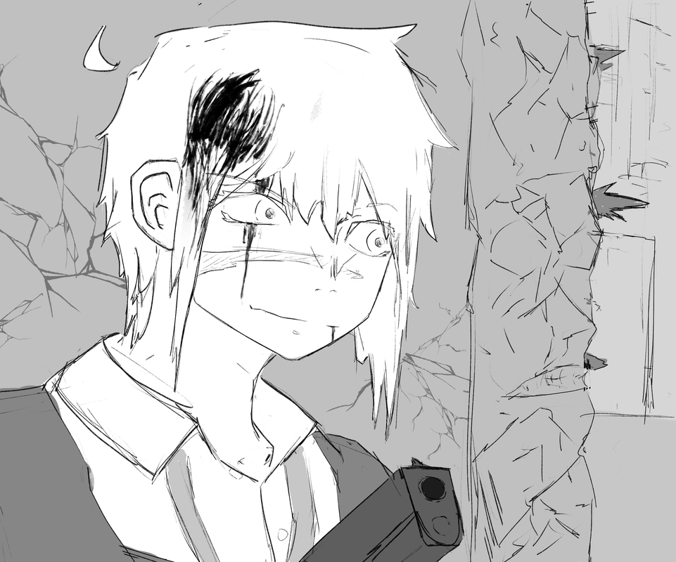
I got so mad I drew up a sketch
It's not that good looking at it but it's fine. I tried to use a least some minor inspirations for art. Comparing this piece to others, it doesn't really look different, but at least I tried using inspiration.
Last edited by Time (July 22, 2023 23:49:43)
Time
Bruh the signature be wacky
- •
- SpecterTheGreat
- Moderator
 Offline
- Registered: March 27, 2020
- Posts: 23,417
Re: Time finally decides to make one of these - An art thread
gun
Specter
When the imposter is sus
ඞඞඞ
- Time
- Moderator
 Offline
- Registered: March 28, 2020
- Posts: 8,584
Re: Time finally decides to make one of these - An art thread
Gun
Its weird, as I said, it doesn't look as different from my normal art, but I liked the way I went about creating it more. Or smth like thar
Time
Bruh the signature be wacky
- •
- SpecterTheGreat
- Moderator
 Offline
- Registered: March 27, 2020
- Posts: 23,417
Re: Time finally decides to make one of these - An art thread
I think it's very important that you enjoyed yourself while drawing. That's why art is made most of the time and anyways I like the ending product (the image you posted).
How do you do the cracks on the wall? Draw them by hand, or use a pattern brush?
Specter
When the imposter is sus
ඞඞඞ
- Time
- Moderator
 Offline
- Registered: March 28, 2020
- Posts: 8,584
Re: Time finally decides to make one of these - An art thread
You are true on that note. Very important
As for the cracks, I drew them by hand.
That's what I wish I could say, but in reality, I found a cool brush.
Time
Bruh the signature be wacky
- •
- Time
- Moderator
 Offline
- Registered: March 28, 2020
- Posts: 8,584
Re: Time finally decides to make one of these - An art thread
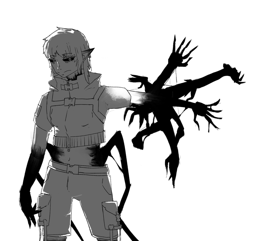
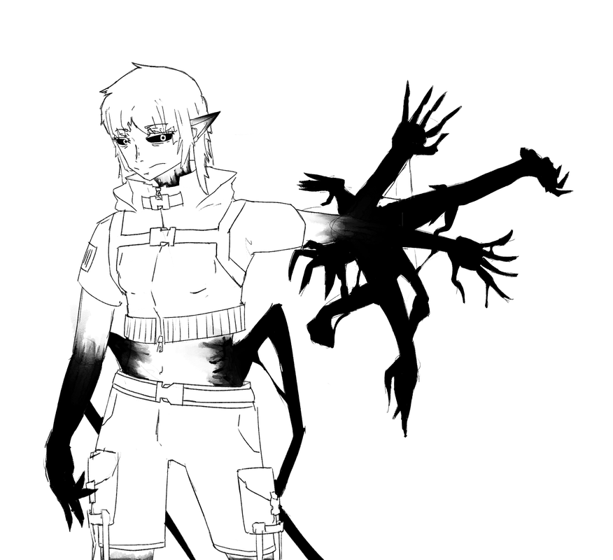
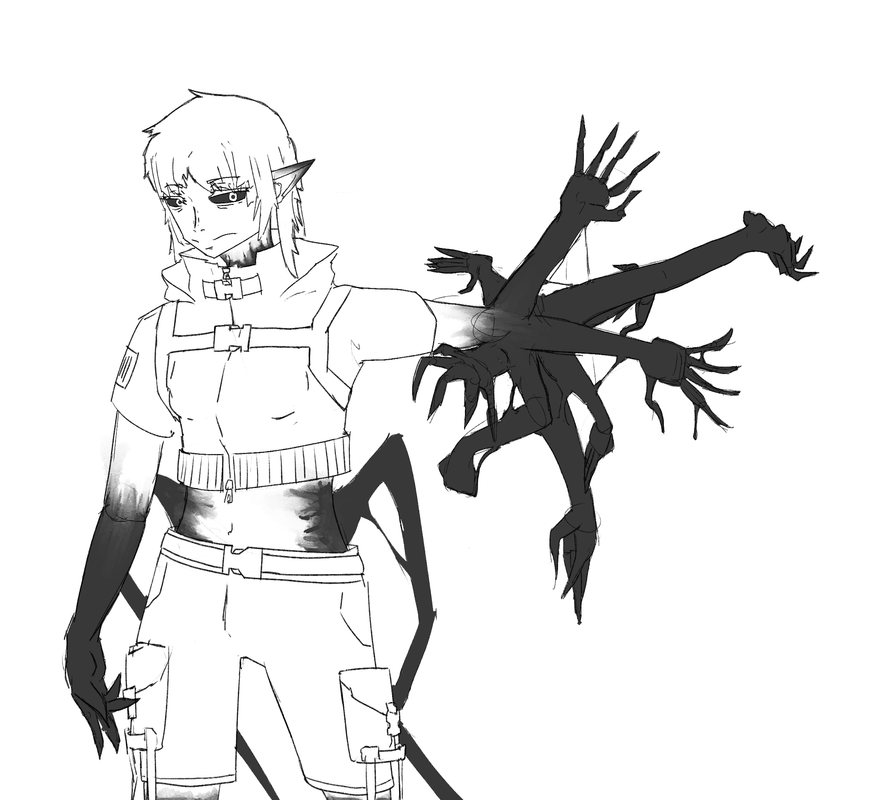
Ok another wip that I probably have a 60-70% chance of finishing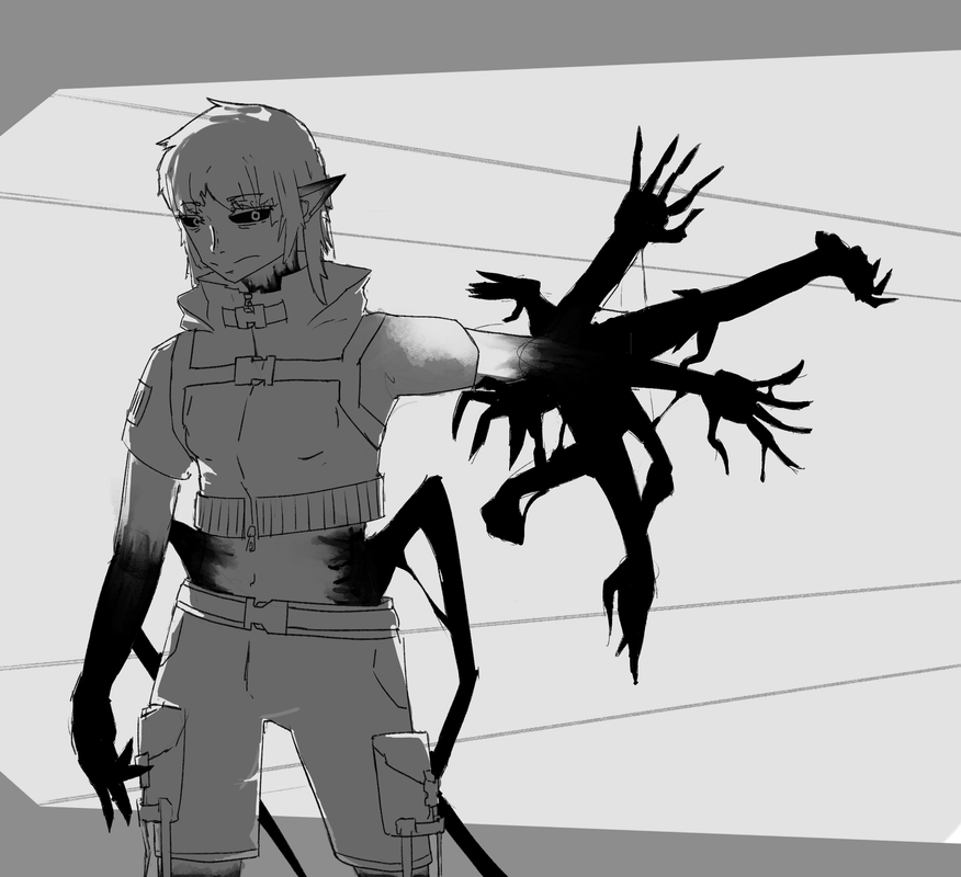
Why would I finish it? Well cuz this is the initial design of a character I had in mind of developing. Adding this one to the character list. Yep. A sci fi story. Yes. An experiment. I really shouldn't be developing such characters when I have a few other stories I should really be writing/developing, and I don't think working on a multitude of stories is a good idea.
Don't have a name though. As per usual whenever someone does this, names are definitely welcomed. Atm, her placeholder name is [Subject-841] - I'll probably use it later, for official things, but actual name? Nothing rn.
Sum varients
Shadow + no bg
No shadow + no bg
No shadow + no bg + lighter gloopy (whatever that black stuff is?)
Last edited by Time (July 25, 2023 13:02:05)
Time
Bruh the signature be wacky
- •
- Time
- Moderator
 Offline
- Registered: March 28, 2020
- Posts: 8,584
Re: Time finally decides to make one of these - An art thread
I should say I was actually going to use a similar post to draw out a Time redesign but I decided to that it would look good for Subject-841
Sorry Eliza
Oh, I also chose 841 for a specific reason too!
Time
Bruh the signature be wacky
- •
- Time
- Moderator
 Offline
- Registered: March 28, 2020
- Posts: 8,584
Re: Time finally decides to make one of these - An art thread
Wow the last time I posted here was july 25th?
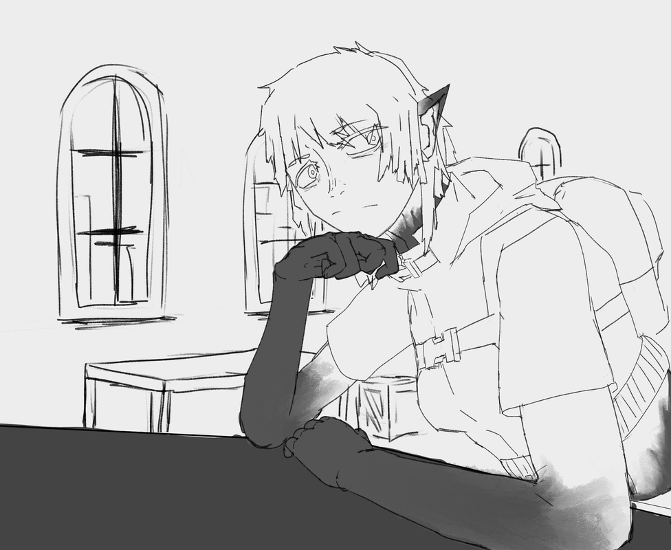
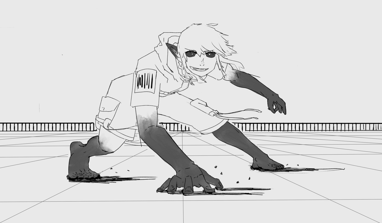
I created some more doodles of the character I last posted about. Updated the name too. Still in prototype phases and still thinking what her design should really be, but for now say hello to...
Victory-841! Or Vic. Just your average escaped biological weapon. You know.
When imbuing her with a personality, I realized she had quite a few parallels with Senshei. So she technically is a Senshei clone that I've designed for personal stories 💀. Currently debating whether to call her that or not tho.
Oh, idk if you guys remember, but Senshei had fallen under my ownership. So I figured I should start using her for something. You know?
Just chilling in the hub area or something
Pose practice. Sliding, and looking quite happy for some combat.
This one is kinda old. Just was practicing poses and ended up drawing her. Used a reference for this one. Feel neutral about it. I realized that posting this without a background would look quite boring, so I sketched one up in 15 min like yesterday 💀
Feel average about it.
Also was just practicing poses and it turned into her. I'm a bit proud on this one, because this pose is all me. Initially I was going to use a reference, but I decided to deviate and create a different pose from the original reference. I would be lying also if I said no reference whatsoever. I had to reference a foot to block out the basics before adding detail.
Overall enjoyed doing it.
Time
Bruh the signature be wacky
- •
- Time
- Moderator
 Offline
- Registered: March 28, 2020
- Posts: 8,584
Re: Time finally decides to make one of these - An art thread
Ah. The age old pattern of the more you look at an art you are proud of, the more you grow dissatisfied. Lovely!
I think I say this lovely half sarcastically, and half genuinely
Last edited by Time (September 14, 2023 00:51:10)
Time
Bruh the signature be wacky
- •
- Echowo
- Prince Peepaw of Darkness
 Offline
- From: BEHIND YOU
- Registered: April 12, 2020
- Posts: 13,393
Re: Time finally decides to make one of these - An art thread
I really enjoy the sliding pose fr owo monching and cronching your art uwu
✨️Echo✨️
he/him xe/xem
- Time
- Moderator
 Offline
- Registered: March 28, 2020
- Posts: 8,584
Re: Time finally decides to make one of these - An art thread
bone apple teeth, sir.
Time
Bruh the signature be wacky
- •
- SpecterTheGreat
- Moderator
 Offline
- Registered: March 27, 2020
- Posts: 23,417
Re: Time finally decides to make one of these - An art thread
I keep trying to reply and I keep getting distracted by the thought of "bone apple teeth" 😭 like I get what you're joking at but like 😭😭😭
Anyways
Something I always really like about your art style is how blocky and linear it is. I think it really shows uniquely in your style because I haven't seen a lot of artists whose lines have such angles and yet make up the human shapes up nicely. I think it's a very unique thing about your art and I always like to see it.
Really like the hands too! Do you use your own for reference or do you just do it by imagination?
Senshei trascending universes huh :eyes:
Specter
When the imposter is sus
ඞඞඞ
- Time
- Moderator
 Offline
- Registered: March 28, 2020
- Posts: 8,584
Re: Time finally decides to make one of these - An art thread
Ah thank you so much. That complement means a lot to me. I think it's a bit of both my inspirations and personal preferences coming through.
As for the hands
1st one, yea I relied heavily on reference
2nd one, I was using imagination/minds eye for it. I've been trying to practice envisioning what's in my mind.
Ha, true. You don't know how many universes Time has already transcended. Or at least characters that are an offshoot of him. He's sort of my default if I don't have a character idea in mind.
Last edited by Time (September 19, 2023 04:09:20)
Time
Bruh the signature be wacky
- •
- Time
- Moderator
 Offline
- Registered: March 28, 2020
- Posts: 8,584
Re: Time finally decides to make one of these - An art thread
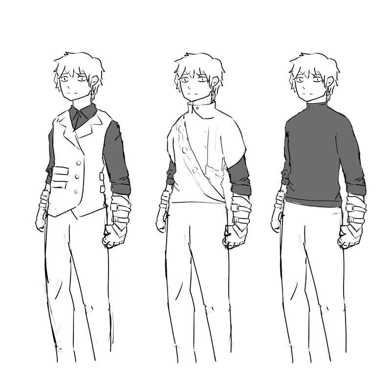
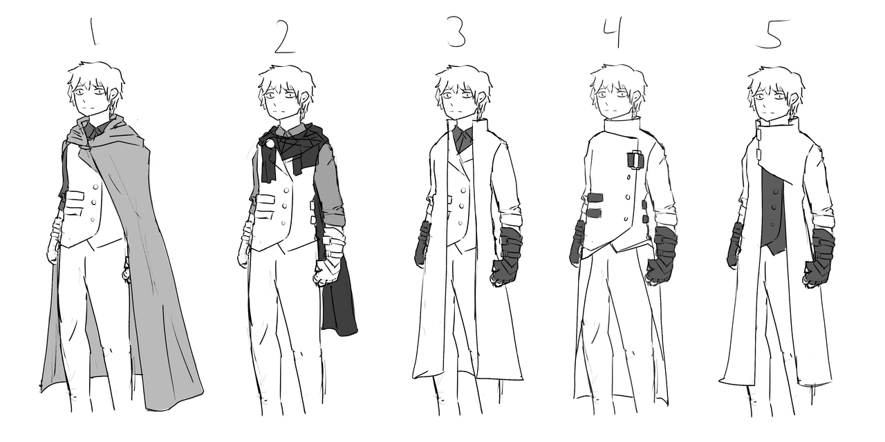
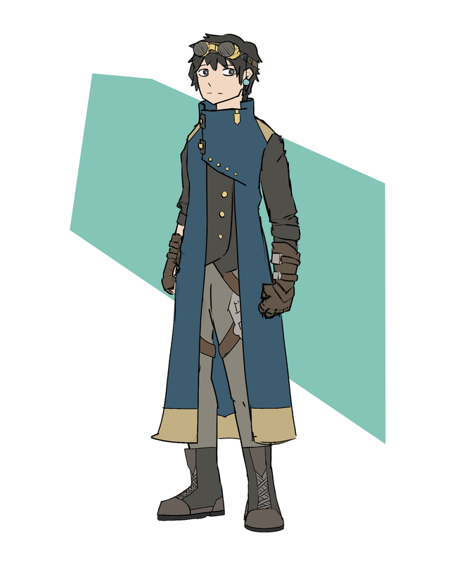
I figured I should post these on the my official art thread lol. Time "redesign" as in its technically still a wip and I look to improve it every now and then. KEEP IN MIND THESE ARE REALLY OLD LIKE JULY OLD
Choosing shirts
Choosing coats
The REAL THING
Last edited by Time (October 3, 2023 00:08:33)
Time
Bruh the signature be wacky
- •
- Time
- Moderator
 Offline
- Registered: March 28, 2020
- Posts: 8,584
Re: Time finally decides to make one of these - An art thread
Also I'm sorry for missing compliments I sometimes miss them because they're like, the last post on my view on the page or I just miss it I'm sorry and I say thank you so much.
This one is specifically to @Eliza complimenting my traditional drawings I didn't catch it. Do you want to hear more about the astronaut and the girl? 😭😭😭
Time
Bruh the signature be wacky
- •
- SpecterTheGreat
- Moderator
 Offline
- Registered: March 27, 2020
- Posts: 23,417
Re: Time finally decides to make one of these - An art thread
Bro really said 🧍🏻♂️
That aside (I know it's the most efficient way for multiple things of the same thing ik) I like all the coat designs like? I feel like they could totally all be different outfits for specific events and occasions. Tell me Time does have all of those coats in his wardrobe and just chosses the main one for daily wear hdshjdsj
Also somehow I keep forgetting Time has a differently colored arm. Nice touch there even though it's not very visible with the outfit.
Specter
When the imposter is sus
ඞඞඞ
- Time
- Moderator
 Offline
- Registered: March 28, 2020
- Posts: 8,584
Re: Time finally decides to make one of these - An art thread
I know right?? I was thinking he could cycle thru them. Never hurts to have a diverse wardrobe for specific situations. I like them a decent bit too.
Yeah, I often forget as well, but I do think it to be a nice addition. Didn't know to exemplify it or not.
Is it just me, but does the coat in that I decided to color make him look like a tower? Or some sort of tall, strong thing? Must be the shape language you know?
Was also thinking of adding earrings, but I don't know whether to a not. I think it may look good, but idk if it would fit him.
edit: COAT, not color
Last edited by Time (October 4, 2023 13:00:48)
Time
Bruh the signature be wacky
- •
- ThreePunchAxel
- Extra Awesome Forumer
 Offline
- From: behind you
- Registered: December 3, 2020
- Posts: 1,240
Re: Time finally decides to make one of these - An art thread
his coat is so cool
I aten't dead
- Basket Cat
- Extra Awesome Forumer
 Offline
- From: inside the walls
- Registered: June 26, 2020
- Posts: 7,941
Re: Time finally decides to make one of these - An art thread
wait is his magic arm his left or right arm I'm confused and can't remember
⋆⭒˚.⋆ ~CAT~ ⋆.˚⭒⋆
unshe/theys knife
~Local Cryptid~
a man's gotta do what a man's gotta do and if he can't then god forbid women do anything
- Time
- Moderator
 Offline
- Registered: March 28, 2020
- Posts: 8,584
Re: Time finally decides to make one of these - An art thread
Thank you for the coat. Does it make him look like a tower tho? Or is that just me?
dude I think it was his right arm 💀💀💀 I always be mixing it up.
Time
Bruh the signature be wacky
- •
- Echowo
- Prince Peepaw of Darkness
 Offline
- From: BEHIND YOU
- Registered: April 12, 2020
- Posts: 13,393
Re: Time finally decides to make one of these - An art thread
Idk why but he makes me think of a tool smith
Anyway, he's giving Slay ![]()
✨️Echo✨️
he/him xe/xem
- Time
- Moderator
 Offline
- Registered: March 28, 2020
- Posts: 8,584
Re: Time finally decides to make one of these - An art thread
Yeah that also fits actually
What are we slaying? Evil dragons of old?
Time
Bruh the signature be wacky
- •
- SpecterTheGreat
- Moderator
 Offline
- Registered: March 27, 2020
- Posts: 23,417
Re: Time finally decides to make one of these - An art thread
Time wrote:
Is it just me, but does the coat in that I decided to color make him look like a tower? Or some sort of tall, strong thing? Must be the shape language you know?
I think more than tower the right word would be kinda tubular? Maybe?
Perhaps that feeling comes from the fact that the collar looks so stiff and straight up, which might not really be a bad thing because it can depend on the angle it's drawn from in different pieces. Another thing I can think of is the way it's all one color and the only decorations are like stripes.
But I don't think it's a big deal since the rest of the outfit gives the design a nice structure, and I'm sure that in more dynamic poses the folds on the coat would keep it from looking too stiff.
One thing I wanted to point out is that I think it goes well with GGaD!Time's personality, yk? Like I feel he's just the kind of character who values structure and order and the like, so having him wear clothing that goes along with his "vibe" is something that contribues to his characterization.
As for earrings I can't see Time wearing them ngl since I don't know that they'd have any practical purpose for him.
Specter
When the imposter is sus
ඞඞඞ
- Time
- Moderator
 Offline
- Registered: March 28, 2020
- Posts: 8,584
Re: Time finally decides to make one of these - An art thread
True. It does give a very structural look. I was iffy on it, but now that you put it that way, that's a good interpretation.
Also for earrings I agree. Just and idea tho. Who knows? Would be some subtle character development.
Time
Bruh the signature be wacky
- •

