- Marsh
- Extra Awesome Forumer
 Offline
- From: your walls
- Registered: August 31, 2020
- Posts: 1,622
Re: An Amateur Artist's Art Array ~ Specter's art collection
O-O That... holy moly that's amazing, oh my cods I'm breathless right now. How do shade with pencil? Also lips, how do you draw lips ;-;
Marsh
Pronouns? Surprise me
----------------------------------------
Mariah Carey DNI
----------------------------------------
18 || Braincells? No
- SpecterTheGreat
- Moderator
 Offline
- Registered: March 27, 2020
- Posts: 23,417
Re: An Amateur Artist's Art Array ~ Specter's art collection
I don't know, I guess I just rely on the fact that I have different pencil shades and I definitely use my blender too much xD. But like, it's kinda weird to draw like this. Bc I have to do the outline (believe me, it looks SO bad without any shading) and then mark where I want to shade and stuff. But I guess I start off by marking darker areas with my 2H pencil, and then I just apply the 2B and blend. I should have used my HB pencil for more shades but I actually lost it lol idk where it is. I use the 4H last because it's the darkest shade I have and it smudges super easily and also its tip is so soft you can't really do a lot of detail with it. Tbh the blender does a lot of the work. You just do areas lightly and the blender takes care of spreading the graphite where you want it. Now it's not that easy T_T because it can also smudge where you don't want it.
For lips, I copied them from reference pictures, so idk I just used pictures.
Anyways I updated the description so I hope that gives a bit more info.
Specter
When the imposter is sus
ඞඞඞ
- •
- SpecterTheGreat
- Moderator
 Offline
- Registered: March 27, 2020
- Posts: 23,417
Re: An Amateur Artist's Art Array ~ Specter's art collection
Tbh none of you should ask me about technique or how I do art because I don't have technique and I don't know how I do art lol I just do it the way I feel it should be done and in the moment.
I think I made Germaine's skin too light but idk
Specter
When the imposter is sus
ඞඞඞ
- •
- Basket Cat
- Extra Awesome Forumer
 Offline
- From: inside the walls
- Registered: June 26, 2020
- Posts: 7,941
Re: An Amateur Artist's Art Array ~ Specter's art collection
BRO
THAT'S SO GOOD
⋆⭒˚.⋆ ~CAT~ ⋆.˚⭒⋆
unshe/theys knife
~Local Cryptid~
a man's gotta do what a man's gotta do and if he can't then god forbid women do anything
- Marsh
- Extra Awesome Forumer
 Offline
- From: your walls
- Registered: August 31, 2020
- Posts: 1,622
Re: An Amateur Artist's Art Array ~ Specter's art collection
:O ty! Traditional art is my weakness and pencils are my fatal flaw in art so I'm always trying to learn how to use them. Idk why but my brain just doesn't quite comprehend how drawing without layers works?
Marsh
Pronouns? Surprise me
----------------------------------------
Mariah Carey DNI
----------------------------------------
18 || Braincells? No
- Echowo
- Prince Peepaw of Darkness
 Offline
 - From: BEHIND YOU
- Registered: April 12, 2020
- Posts: 13,394
Re: An Amateur Artist's Art Array ~ Specter's art collection
OH MY GODSSSS, I AM SIMPING SO HARD FOR THIS. BWHDJSJFM OH MY WJFJWJJFJEJF SPECTER YOU ARE KILLING ME WITH THIS BEAUTY WJJDJSKFJS THE FACE IS SO GOOD, ESPECIALLY THE NOSE AND LIPS JWJDJS I AM WJFJJSJFJSKD AHHHHHHHH
💜Echo💜
he/him xe/xem
- Echowo
- Prince Peepaw of Darkness
 Offline
 - From: BEHIND YOU
- Registered: April 12, 2020
- Posts: 13,394
Re: An Amateur Artist's Art Array ~ Specter's art collection
SHE LOOKS SO GENTLE AND I LOVE HER SO MUCH
💜Echo💜
he/him xe/xem
- Time
- Moderator
 Offline
- Registered: March 28, 2020
- Posts: 8,584
Re: An Amateur Artist's Art Array ~ Specter's art collection
Now that
that is nice
Did I say I would only go into school art competitions and stuff if I knew how to draw more realistically? Yeah. I would enter an art contest if I could draw like that
that was a weird compliment but yeah
Time
Bruh the signature be wacky
- SpecterTheGreat
- Moderator
 Offline
- Registered: March 27, 2020
- Posts: 23,417
Re: An Amateur Artist's Art Array ~ Specter's art collection
Thank you, guys xD
@Time
Well it's not really that I know how to draw like this lol. I copied existing pictures in order to build the drawing.
And I think you don't really need to learn how to draw realistically in order to enter an art contest. Everyone has their own style, y'know?
Specter
When the imposter is sus
ඞඞඞ
- •
- SpecterTheGreat
- Moderator
 Offline
- Registered: March 27, 2020
- Posts: 23,417
Re: An Amateur Artist's Art Array ~ Specter's art collection
I sketched s
And I actually wasn't gonna post them but someone asked for them lol. These images are pose/proportion practice.
So it's some OCs in beachwear.
I'm sorry for the quality lol I'm using a camera I don't normally use and it's hard to figure out the angle and stuff. These obviously look better on actual paper lol (not counting the real porportion errors lol).
Anyways this is just the ones that came out looking okay (I'm sorry but I wasn't going to show all of them lol).
Dilanne
The picture angle sucks lol. Also fun fact: This outfit was her original set of clothes until i redesigned her into her current clothing preference.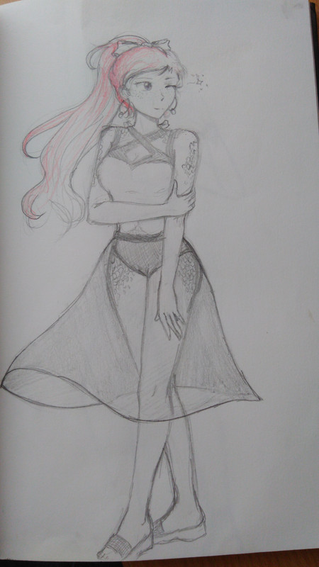
Germaine. (Please ignore my fingers in the picture lol)
Uh I tried a slightly sideways pose and I'm not used to doing it so it looks weird, and the head also looks weird, but I like her dress (no swimsuit for Germaine lol sorry). Also antlers are hard to draw and I have never drawn a hat like that before.
She has seashells in her basket.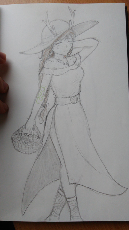
Sollux.
Ok the angle here makes the proportions worse than irl lol I should have retaken the picture.
I like her flip flops and the ruffles on her two-piece.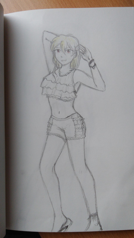
I cringe a little at this one because I don't know how to draw men lol.
Also by the way this is Dalia's clothing taste lol Allen wouldn't wear shorts.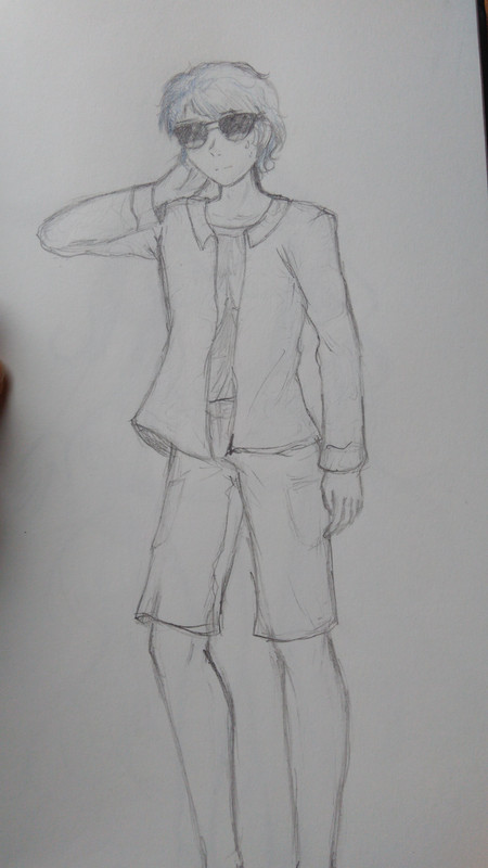
The legs are weird. Also he's wearing sandals but the image cut them off lol. If the face looks weird it's because I messed it up and then scribbled sunglasses over it in an attempt to make it look better.
And if Allen had sunglasses, then of course Dalia should have them so they're matching.
Once more, there's the problem of the picture's angle (bruh I can't be a photographer lol) messing with the proportions. Uh I like the swimsuit and the coverup over it. I didn't sketch Dalia's hair very well, but she has long hair and a lot of hair.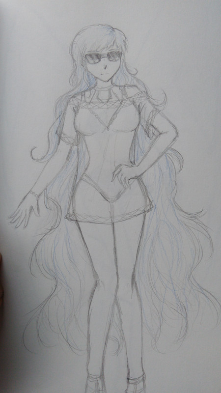
Uh yeah lol I hope that's good enough lol
Someday I'll redraw them or draw better ones.
Just a reminder that these were drawn for practice. Also the designs are mine xD I probably should have looked up real references instead of just trying to come up with stuff. The beachwear would have looked a whole lot better if I had done that.
Specter
When the imposter is sus
ඞඞඞ
- •
- SpecterTheGreat
- Moderator
 Offline
- Registered: March 27, 2020
- Posts: 23,417
Re: An Amateur Artist's Art Array ~ Specter's art collection
Ok now two more images because I'm getting tired of taking pictures and that'll be it for today.
I sketched this one like in March I think lol. I didn't bother to finish Dalia's left hand xD. By the way, that's a kind of fancy braid Allen knows how to do. And Dalia likes it. And also I like that dress lol I designed it and I'm proud of it.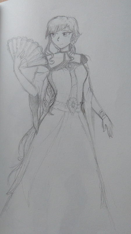
Idk how to draw handheld fans.
Then this one is from like three weeks ago or so.
Hair buns are hard to get right. Also I referenced a base for the pose. She's supposed to be holding a little dish in her left hand but I didn't draw her hands and arms correctly lol.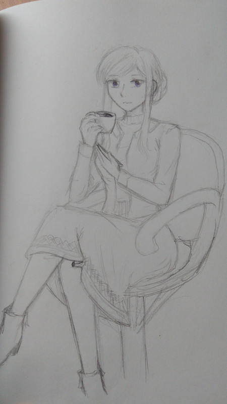
Just out of curiosity, can you tell who this is? I hope she's recognizable lol.
Specter
When the imposter is sus
ඞඞඞ
- •
- SpecterTheGreat
- Moderator
 Offline
- Registered: March 27, 2020
- Posts: 23,417
Re: An Amateur Artist's Art Array ~ Specter's art collection
Adèle when she was alive.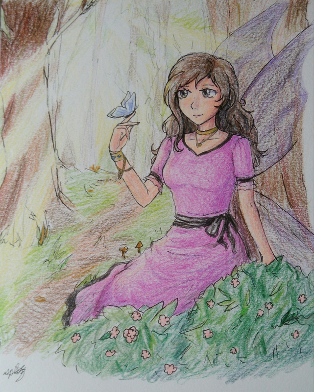
The art is not very good but I'm posting this for the colors. Like three and a half hours straight in linearting and coloring were spent here lol.
Anyways I tried at a handdrawn background, but I think I chose one too complicated lol. My mind chose it and my hand is not skilled enough to show the mental image I have xD. It's supposed to be a sunrise or something but anyways the sunlight is supposed to be streaming through the trees, so that's why there's those yellow-white areas in there.
Don't talk about proportions please I know they're not that good and also the face doesn't look very good either lol.
To be honest I love the hand proportions though lol.
Well to be honest I was playing around with the colors, so I've used way too many hues here. Idk lol like the skin has like six or five different colors used, idk what I did for the trees (I even put gold in there idk) and the grass and bushes have like ten tones of green used. Maybe if I actually knew color theory I would know what colors to use and which ones not to use. Because like it's really hard to erase mistakes done with colored pencils lol.
The colors look more vibrant in paper lol the image kinda decreased their quality.
Specter
When the imposter is sus
ඞඞඞ
- •
- SpecterTheGreat
- Moderator
 Offline
- Registered: March 27, 2020
- Posts: 23,417
Re: An Amateur Artist's Art Array ~ Specter's art collection
doodle
Specter
When the imposter is sus
ඞඞඞ
- •
- SpecterTheGreat
- Moderator
 Offline
- Registered: March 27, 2020
- Posts: 23,417
Re: An Amateur Artist's Art Array ~ Specter's art collection
The meme was funnier in my head.
Specter
When the imposter is sus
ඞඞඞ
- •
- Echowo
- Prince Peepaw of Darkness
 Offline
 - From: BEHIND YOU
- Registered: April 12, 2020
- Posts: 13,394
Re: An Amateur Artist's Art Array ~ Specter's art collection
U N S L E E P
UNSLEEP ME UP INSIDE (Save meeeee)
💜Echo💜
he/him xe/xem
- SpecterTheGreat
- Moderator
 Offline
- Registered: March 27, 2020
- Posts: 23,417
Re: An Amateur Artist's Art Array ~ Specter's art collection
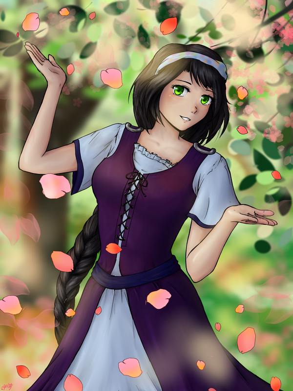
I bring a new piece of art. The original canvas is really large, but I scaled the image down. I hope it hasn't lost the quality and the details in it.
Description coming tomorrow, but I'm proud of the result right now so I'm posting it already.
Specter
When the imposter is sus
ඞඞඞ
- •
- SpecterTheGreat
- Moderator
 Offline
- Registered: March 27, 2020
- Posts: 23,417
Re: An Amateur Artist's Art Array ~ Specter's art collection
I drew Leila.
She's Martin's mother, and in the canon GGaD roleplay her status is unknown (she's presumed dead). This is her GGaD appearance, something "from long ago", an image of happiness from a time before she met the TMG. Just a young woman enjoying the moment.
That's what the image is supposed to show. Her design is pretty simple, her clothes just something "anyone" would wear, so there's not much to comment about them.
Although she isn’t really directly related to nature, you could say flower petals are kind of her symbol. I like to use them (for reasons) when I sketch her, and now I put them in the finished piece here.
Aside from that, I guess I also tried to put in some “symbolism”, but I’m not going to talk about that. Just focus on the setting and Leila’s smile.
~
The original canvas for the image is in 2400x3200 px size, making it the largest canvas I've ever used in my art life. Something nice about having a larger size to work with is that more details can be added. Like color fades, easier/subtler blending (that I have yet to master), tiny lines for the hair...you can imagine. And well it is my first time working like this, so I feel like I didn't use the size to its full potential. It would be perfectly suited for more complex kinds of clothing, more elaborate hairdos, and small details in the surroundings. But I think that it's not bad for a first time!
I'm proud of the background too. I used a layer-blurring option I found, and that's why you can see kinda like the focus of the image is on Leila. Tbh now that I think about it I should probs have blurred the borders of her dress as well to add to the idea of a blurred focus picture. Anyways, I did most of it by hand lol. Every single blurred leaf in the background was drawn by me (they all have different colors if you look at them closely), the branches too, the tree behind, and the patches of sunny grass too. The flower petals and tiny flowers came from a brush, but I edited its colors and the shapes. It was kinda hard work to make sure I was picking the correct petal shapes and positioning them correctly, because I didn’t want them to take away the focus from Leila, and I didn’t want them to obscure her too much.
Both the background and Leila’s pose have been referenced from a stock image I found, so don’t give me that much credit.
I don’t know if I love how the face came out and I’m never sure of the coloring, but if you don’t focus on the small errors there, it fulfills its part in the overall piece.
There’s an attempt at foreshortening on that arm and hand there xD. I don’t know how well I did. At least it kinda looks like a hand?
The hair was fun to color, but, like always, I have no solid idea of what I’m doing to color lol I just go doing what looks good. Maybe some extra blueish shades in the darker areas would have worked well? I kinda failed at doing the lighting on the hair too, but I think the extra overall lighting on top of everything fixes it. This also goes for the skin.
Leila’s model got two overlays, one for the cold shade produced by sunlight, and the other one was supposed to emphasize the warm lighting,,,but I didn’t do that one well. I feel there’s a lack of orange and yellow tones for the light.
I think this is all the general information. I mainly used the watercolor brush for coloring, a custom brush for linearting, and some flower and flower petal brushes for extra effects. Oh and airbrush lol for lights
I recommend opening the image in another page so you can zoom into it and check out all the shades of color I used xD. You’ll also be able to see mistakes and probably some parts where I forgot to erase extra color. Because I can’t draw to perfection yet lol.
I’m proud of my work here, but I know it’s not the best. Several things have been tested out in this drawing and I will try to continue improving them for my next pieces. I'd also love to talk more about the process xD but I don't wanna make this too long (oops it's already long) and I'd get kinda technical anyways.
Specter
When the imposter is sus
ඞඞඞ
- •
- Basket Cat
- Extra Awesome Forumer
 Offline
- From: inside the walls
- Registered: June 26, 2020
- Posts: 7,941
Re: An Amateur Artist's Art Array ~ Specter's art collection
It looks so nice I don't care if there are errors lol
⋆⭒˚.⋆ ~CAT~ ⋆.˚⭒⋆
unshe/theys knife
~Local Cryptid~
a man's gotta do what a man's gotta do and if he can't then god forbid women do anything
- Echowo
- Prince Peepaw of Darkness
 Offline
 - From: BEHIND YOU
- Registered: April 12, 2020
- Posts: 13,394
Re: An Amateur Artist's Art Array ~ Specter's art collection
Hhhhhhng PRETTY
💜Echo💜
he/him xe/xem
- Time
- Moderator
 Offline
- Registered: March 28, 2020
- Posts: 8,584
Re: An Amateur Artist's Art Array ~ Specter's art collection
Happiness before the TMG kinda just took it away because of "Ah yes, I like money". Epic that you're actually developing your character's parent(s) and have at least one of them an appearance. Unlike me, I'm too lazy for that : (
All the coloring and lighting looks great! I like how it's reflective on the skin because I don't really do that at all if I ever color something and it's something I myself might want to do later on. Oh, I also like that you were able to texture the hair as well.
After just a quick glance to the anatomy, it looks pretty a-ok to me! The hands and everything look good! I wish that I could quickly just do some foreshortening and just be cool with it, and not spend like, 40 minutes or however long I do with that stuff. And even after that idk how good it is.
Though I did notice with the anatomy may be the implications of where the collarbones might be are a little off. To me, they just don't seem aligned with her shoulders and maybe might need to be moved a little bit up to the left? I haven't studied anatomy too hard, but that's the feeling I am getting from looking at it.
Time
Bruh the signature be wacky
- SpecterTheGreat
- Moderator
 Offline
- Registered: March 27, 2020
- Posts: 23,417
Re: An Amateur Artist's Art Array ~ Specter's art collection
Lol my post got eaten when I tried to reply so a very late thank you to you guys and @Time I'll keep your tips in mind!
~
I drew something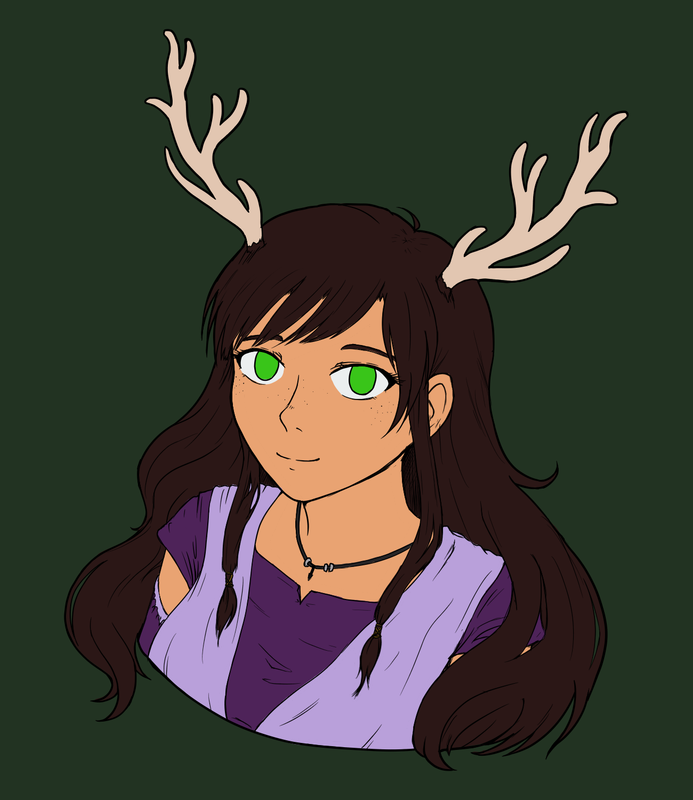
I fear shading so have the colored version for now.
Specter
When the imposter is sus
ඞඞඞ
- •
- SpecterTheGreat
- Moderator
 Offline
- Registered: March 27, 2020
- Posts: 23,417
Re: An Amateur Artist's Art Array ~ Specter's art collection

My heart is thumping so hard as I post this xD
I'm just proud lol
Specter
When the imposter is sus
ඞඞඞ
- •
- Echowo
- Prince Peepaw of Darkness
 Offline
 - From: BEHIND YOU
- Registered: April 12, 2020
- Posts: 13,394
Re: An Amateur Artist's Art Array ~ Specter's art collection
JWJCJSKCKSKKFE GORGEOUS
Stop making me simp for herrrrrrrrrr bwbfnsncjsk
💜Echo💜
he/him xe/xem
- Basket Cat
- Extra Awesome Forumer
 Offline
- From: inside the walls
- Registered: June 26, 2020
- Posts: 7,941
Re: An Amateur Artist's Art Array ~ Specter's art collection
:0 pretty
⋆⭒˚.⋆ ~CAT~ ⋆.˚⭒⋆
unshe/theys knife
~Local Cryptid~
a man's gotta do what a man's gotta do and if he can't then god forbid women do anything
- SpecterTheGreat
- Moderator
 Offline
- Registered: March 27, 2020
- Posts: 23,417
Re: An Amateur Artist's Art Array ~ Specter's art collection
Just kinda practicing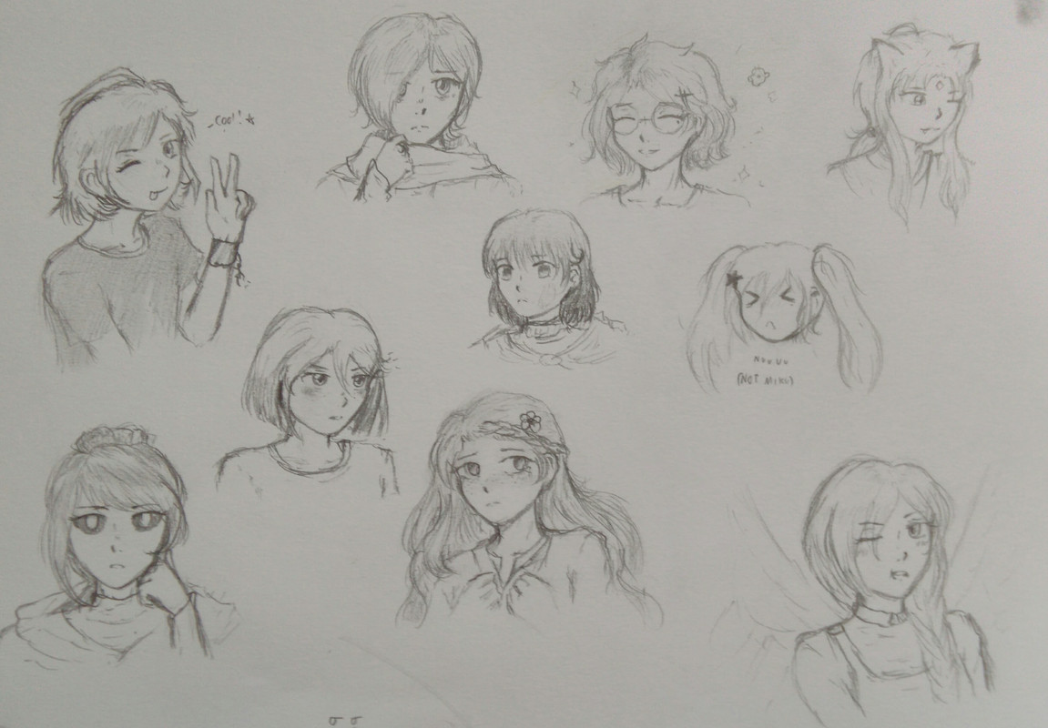
I forgot to sketch one of Time and Axel's characters lol sorry
Anyways I was sketching and uh well I didn't like the first sketches I made (two in the middle) but I continued.
I wanted to draw Marsh too (bottom left) so I did a little sketch, but I messed up the expression lol they're supposed to be in thought.
At the top corner is Kewl. Then, the rest of the top row is Anima, Francis, and Topaz (idk if anyone knows her though).
In the center are Dion (rip I messed up the eyes) and Youri and well the third one is supposed to be Cheetah with pigtails but idk lol those last two didn't come out as well as I wanted.
Then, the last two are Aurae and Aniyah (bottom right).
Specter
When the imposter is sus
ඞඞඞ
- •
- Echowo
- Prince Peepaw of Darkness
 Offline
 - From: BEHIND YOU
- Registered: April 12, 2020
- Posts: 13,394
Re: An Amateur Artist's Art Array ~ Specter's art collection
HWHDKSKXKKSKD FRANCIS LOOKS SO ADORABLE WHJXJAKF
O W O NICE SKETCHES
💜Echo💜
he/him xe/xem
- SpecterTheGreat
- Moderator
 Offline
- Registered: March 27, 2020
- Posts: 23,417
Re: An Amateur Artist's Art Array ~ Specter's art collection
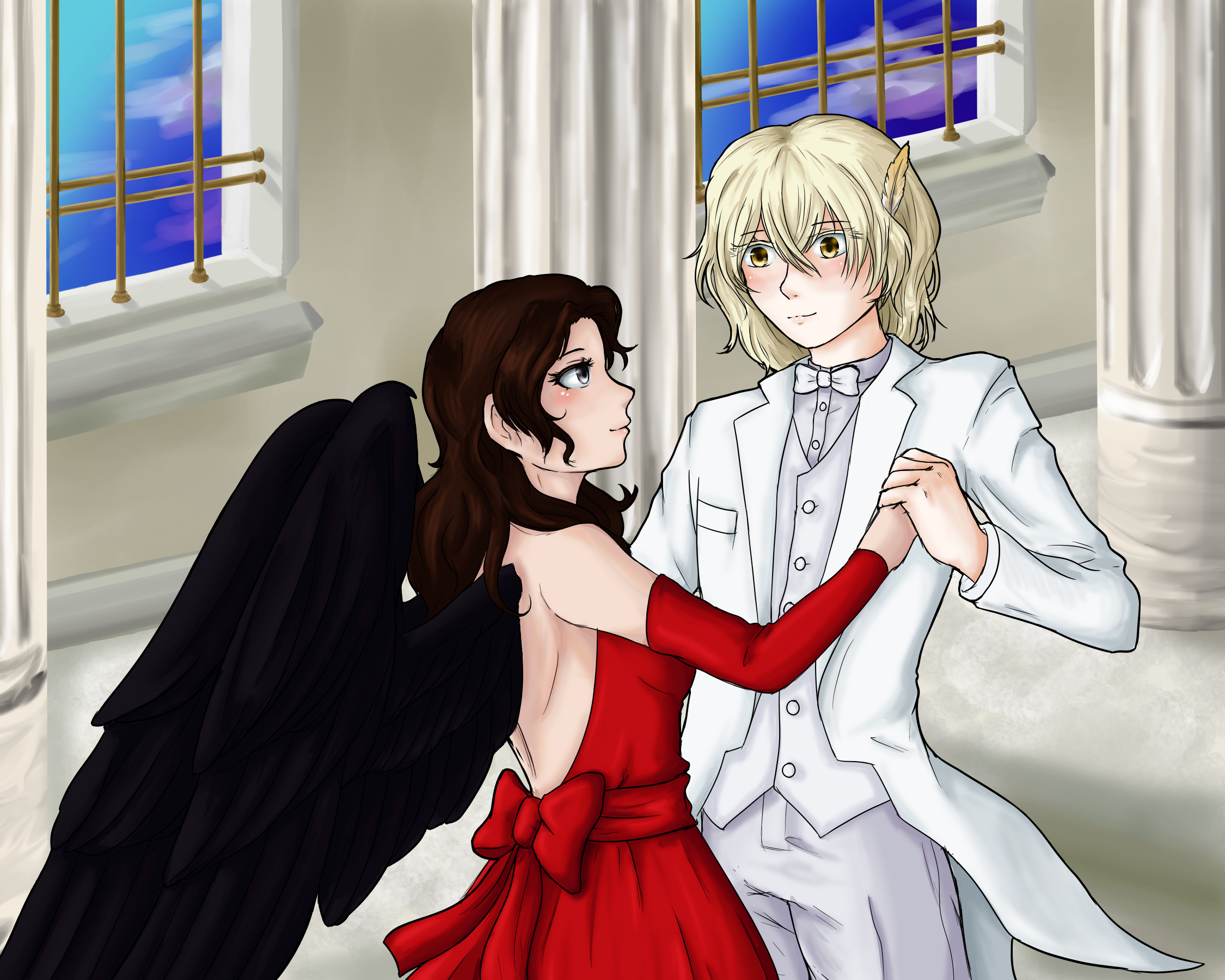
I dedicated too much time to this so I should probably post it...End me *cries*.
Well where to start lol. Modesty aside, I completely wowed myself with the result xD. I know it’s not a very polished finish, but it looks pretty good. It kinda bothers me that the more I look at it the more errors I see.
It’s kinda supposed to be a dancing scene I guess. It’s fanart btw so like just out of my mind, this isn’t canon and I don’t even know if it can be. Anyways, I sketched the couple first, and I tried linearting with slightly different pen thicknesses. The borders are thicker than the inner lines. Btw, the canvas isn’t very large, so I wasn’t able to add many “fine” details. The lines still look a little thick but it’s okay. The coloring was pretty easy because I already knew what I was going for. I did make a major mistake in it tho. The shadows I used aren’t strong enough. Original color version doesn’t have major lighting embellishments, it’s just regular lighting. I kind of regret trying to add too much detail to certain things (for example, I drew a lot of strands on Hitan’s feather but they mostly disappeared after I had to layer more color on top ![]() ) when I should have gone for more simple color strokes.
) when I should have gone for more simple color strokes.
I don’t know how to draw or shade wings very well lol. I should have used references for that. Also I’m uhmmmmm not very proud of that side view of Helen’s face :’) but it’s not that bad. I really couldn’t figure out what to do to make it look better when I was sketching/linearting, but now I think I’ve pinpointed at least one thing that makes it look weird. Please don’t focus too much on that part xD. Face proportions on the two are weird and I apologize. I kinda rushed with that because then I was really motivated to finish. And I also apologize for how Hitan looks lol I’m not very good at drawing males xD.
About the clothing choice, I didn’t put a whole lot of thought into it. I know Hitan wears white, so he got a formal suit in all white. I’m pretty sure that Helen wouldn’t like to wear a dress, but hey this is fanart lol, anyways I thought she’d look nice in red. It’s a backless dress because I couldn’t figure out how to make her wings pop out. And there’s a ribbon because I like ribbons and I can rarely pass up the opportunity to put at least one on a dress lol. I feel I should have done something a bit fancier with Helen’s hair, maybe like one ribbon or maybe I could have drawn it in a braid, but nah I just made it orderly and removed the frizz xD. Hitan’s hair was fun to do but I don’t know if it’s accurate or not lol I wasn’t sure about the bangs,,,if I had added more it would’ve covered the eyes but now I feel I didn’t add enough hair on his forehead xD. I like drawing hair though and shading it was interesting because I tried to not add much light as it would come from another source on another upper layer.
By the way, there’s something interesting about the clothes in the finished image that I tried to add. Because of how light reflects, Helen’s dress has a bit of a whiteish glow from Hitan’s clothes, and Hitan’s suit has a (very faint) reddish hue in certain parts from Helen’s dress. It’s my first time trying to do something like this so I just used the airbrush and left it like that lol.
Now, ah, the background. Oh, that took me a whole LOT more time than the previous part. Look, I had originally sketched a more or less flat background (directly horizontal) but then I decided that it would look nice if I added a bit more…depth? And yeah, I tried to do that lol. I had to resketch it and then work with lineless because I don’t like having many black lines on my backgrounds. It can’t be seen very well in the finished version but I added texture to the floor and the wall has shading lol. I shouldn’t have bothered with that tbh but I did.
The columns there are another story lol. I tried to texture them a little too but only managed to do it in the lower part. The other part uhm I tried to make it look like they’re carved columns. That was painstaking work and it even looks a little shabby lol. There’s faint original shading but, once again, I shouldn’t have added that because I could add it on another layer later on.
And the windows, the windows,,, They ate a lot of my work too lol. They’re not textured, but I shaded them with care so they’d look like stone or marble. I think I kinda failed but the shading is there anyways lol. I also took the time to add shadows for the golden rods there. I’m sure I didn’t have to shade those rods (Idk what they’re called lol) as much as I did but anyways who cares lol I did it and I wasn’t going to delete my own work. I added little decorations in the places that connect to the sides of the window because otherwise I had a bothersome feeling that they looked like prison windows????
The sky gave me a bit of a struggle because the moon is supposed to be somewhere there and I had to decide what shades of blue to use because of the glow. Then I decided to sketch in some clouds and yeah.
Now, for the final part. A lot of the color I added can’t be seen very clearly because of the “beautiful” moonlit night effects I slapped on top of everything. I can confidently say that trying to figure out the hues and layer effects and opacity for it all took me almost as long as drawing the background. Anyways, for the effect, there’s four layers. One made everything blue to give the illusion of nighttime, another one has diffused blueish lighting, and another one has light on the borders to emphasize the parts that the moonlight is hitting directly. There’s one more layer I had to add because, as I mentioned before, the shadows I colored in the base weren’t dark enough. So there’s dark blue shadows to make the light pop out even more. It was tough to find out exactly how dark I wanted it to be. I don’t know if it looks okay lol. Well, when I finished it all, I realized I forgot to add the moonlight streaming through the windows. It took like a whole two hours bruh I am not kidding. There was a lot of erasing and layer-moving-around involved. I’m rather proud of the finish but I know it looks a little rough. The shadows that would be cast by the separation of the window bars aren’t as strong as I feel they should be. At least it kinda gives the idea of what the effect should look like. That’s good enough for a first time so yeah I left it like that. Besides, it was late and I was tired.
But if you ask me, I think I overdid it with the night light/shadows effects. It’s my first time trying something like this anyways so I guess I can learn from this experience.
Welp! If you want to see the version without effects, click here! It might look kind of plain but I thought it would be interesting if I posted it too.
And that’s all I have. I finished this piece for the love of art, because I mean I had something in mind and I just couldn’t stop until I had at least tried to show it. I mean the lighting lol. I was excited for that and I think it’s the most interesting part of the piece.
So, well, this is a long description I wrote lol. I’m sorry xD you don’t have to read it all, but I hope that at least you can enjoy the piece!
Specter
When the imposter is sus
ඞඞඞ
- •
- Echowo
- Prince Peepaw of Darkness
 Offline
 - From: BEHIND YOU
- Registered: April 12, 2020
- Posts: 13,394
Re: An Amateur Artist's Art Array ~ Specter's art collection
Oh my gods,,, oh my go d s ,,, *sobs* oH my g o d ssss I lov e
💜Echo💜
he/him xe/xem
- Basket Cat
- Extra Awesome Forumer
 Offline
- From: inside the walls
- Registered: June 26, 2020
- Posts: 7,941
Re: An Amateur Artist's Art Array ~ Specter's art collection
it's
IT'S SO CUTE MY HEART
⋆⭒˚.⋆ ~CAT~ ⋆.˚⭒⋆
unshe/theys knife
~Local Cryptid~
a man's gotta do what a man's gotta do and if he can't then god forbid women do anything
- GalaxianExplosion
- Freezing Water in Mouth
 Offline
- Registered: March 27, 2020
- Posts: 26,839
Re: An Amateur Artist's Art Array ~ Specter's art collection
I probably shouldn't have been analyzing this thematically lol. Anyways, first gotta start off with how I probably should be interpreting it as a whole, right?
So, starting off, I really like how you portrayed Hitan here. I don't specialize in complimenting, sorry, but I'll note that the feather is actually pretty small now that I look at it xD. It's actually good for it to be small (regardless of accuracy) because I see it and I think "awww smol" if that makes any sense at all. If it doesn't make sense, just know it has to do with character thingamajigs lol, so don't worry.
Then, I really like the setting. I think you have real talent with drawing architecture and stuff. It's kinda like how Eliza is with proportions and how Echo is with colors.
But you know me. I can't stay on the bright side forever, so now I'm going back to the thematic analysis thing. I guess as context, I'll say that I was expecting the lighting to be much more bright and the background to be something grand. Y'know, like, back when you had showed me the sketches. But the thing is--what you've conjured is actually more fitting in the theme sense because it fits how Hh was. They had their little happy moments as a couple, and those were definitely more emphasized. Even here, in this particular picture, one can also see them having their little happy moment; but unlike other couples, where they might be dancing in a ballroom with others, Hitan and Helen can only dance alone in a dark and shadowy place. It's not because that they belong with the shadows, but rather that at least their presence will not hurt the darkness around them.
Other than the darkness, the light is bright, almost too bright. I'm interpreting it as if it were an illusion. Hitan's an angel, after all, and creating such a setting would be beyond simple for him. But illusions are ultimately illusions. They are images both Hitan and Helen are turned away from; that too-bright light instead illuminates into a fog behind him. He could only shield it from her for so long.Lol yes I have a sad interpretation. Please deal with it
-Galaxian-
Whoever you are, no matter how lonely,
the world offers itself to your imagination,
calls to you like the wild geese, harsh and exciting—
over and over announcing your place
in the family of things.

